Web Components give us a native way to build reusable UI primitives. But once you start building more than one custom element, a practical question appears quickly:
What should you do when two components have different semantics but share the same behavior?
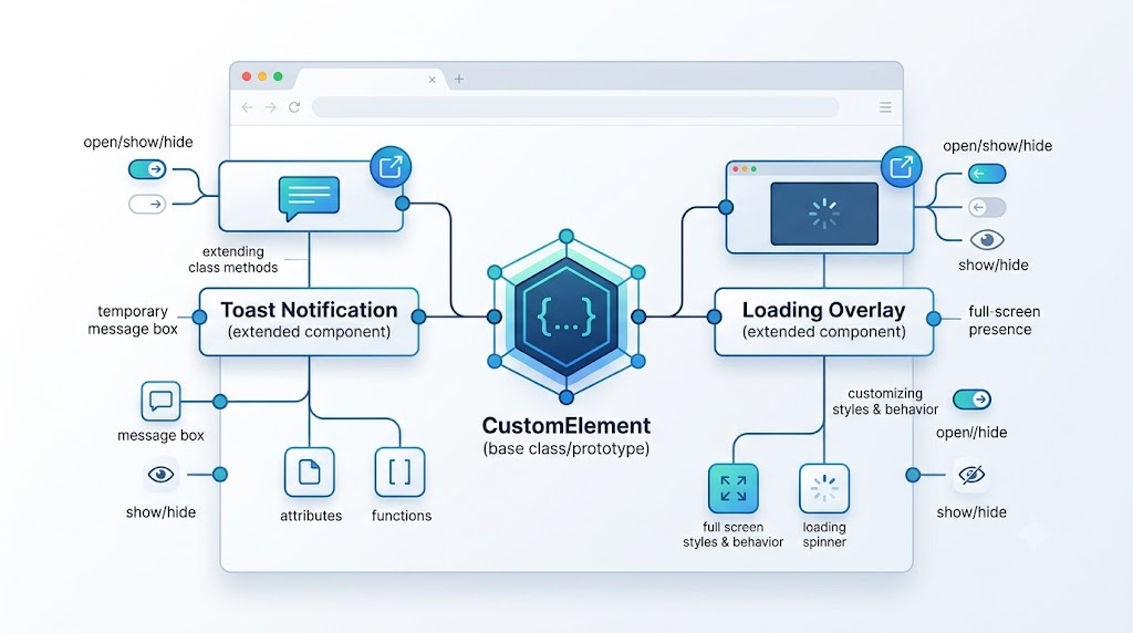
For example, a toast notification and a full-screen loading overlay are not the same component. A toast displays a temporary message. A loading overlay blocks the interface and shows progress. But internally, both need familiar behavior: show, hide, react to an open state, and render something when displayed.
Instead of duplicating logic or misusing one component for everything, we can use JavaScript class inheritance and prototype extension to keep the code reusable while preserving semantic clarity.
The Core Idea: Separate Behavior From Semantics
A custom element is just a JavaScript class registered with customElements.define(). That means it can use the same object-oriented tools as other JavaScript classes: inheritance, method overriding, prototype extension, and static methods.
In this article, we will use a small toast component as the base example. Then we will build three patterns on top of it:
- Create a base
<zxx-toast>custom element. - Inherit from it to create a new
<zxx-loading>element. - Extend the original toast component from another JavaScript file.
- Improve the developer experience with a static API.
1. Building the Base Toast Element
The base component manages one core state: whether the element is open.
When the open attribute appears, the toast becomes visible. When it is removed, the toast hides. The component also exposes show() and hide() methods, so other code does not need to manipulate attributes directly.
class ZxxToast extends HTMLElement {
    static get observedAttributes () {
        return ['open'];
    }

    get open () {
        return this.hasAttribute('open');
    }

    set open (val) {
        this.toggleAttribute('open', val);
    }

    render () {
        clearTimeout(this._timer);
        this._timer = setTimeout(() => {
            this.hide();
        }, 3000);
    }

    show () {
        this.open = true;
    }

    hide () {
        this.open = false;
    }

    attributeChangedCallback (name) {
        if (name == 'open' && this.open) {
            this.render();
        }
    }
}

if (!customElements.get('zxx-toast')) {
    customElements.define('zxx-toast', ZxxToast);
}
This snippet demonstrates the most important Web Components lifecycle idea in the example: the component watches the open attribute, and when that attribute changes, it calls render().
The useful part is that show() and hide() are now reusable behavior. Any component that inherits from ZxxToast automatically gets the same visibility logic.
The CSS can then decide how the element looks when it has the open attribute:
zxx-toast {
    position: fixed;
    left: 50%;
    top: 24px;
    display: none;
    min-width: 220px;
    padding: 13px 18px;
    border-radius: 8px;
    background: #17202a;
    color: white;
    text-align: center;
    transform: translateX(-50%);
}

zxx-toast[open] {
    display: block;
    animation: toast-in 180ms ease-out;
}
With this structure, the JavaScript owns behavior, while CSS owns presentation.
2. Creating a New Custom Element by Inheriting the Old One
Now suppose we want a loading component.
A loading overlay is not semantically the same as a toast notification. We do not want to use <zxx-toast> to represent loading just because the behavior is similar. Instead, we create a new custom element: <zxx-loading>.
The key is that ZxxLoading extends ZxxToast.
class ZxxLoading extends ZxxToast {
    render () {
        this.innerHTML = '<i class="spin"></i>';
    }
}

if (!customElements.get('zxx-loading')) {
    customElements.define('zxx-loading', ZxxLoading);
}
This is the cleanest part of the pattern.
ZxxLoading inherits open, show(), hide(), and attributeChangedCallback() from ZxxToast. It only overrides render() because loading needs different visual content.
The result is a genuinely new custom element with shared internal behavior.
The CSS completes the distinction between toast and loading:
zxx-loading {
    position: fixed;
    inset: 0;
    display: none;
    place-items: center;
    background: rgba(15, 23, 42, 0.42);
    backdrop-filter: blur(2px);
}

zxx-loading[open] {
    display: grid;
}

.spin {
    width: 54px;
    height: 54px;
    border: 5px solid rgba(255, 255, 255, 0.45);
    border-top-color: white;
    border-radius: 50%;
    animation: spin 820ms linear infinite;
}
The semantic difference is now clear:
<zxx-toast> means notification.
<zxx-loading> means loading state.
They share implementation details, but they do not pretend to be the same UI concept.
3. Extending a Web Component From Another JavaScript File
Inheritance is useful when you want a new element. But sometimes you do not want a new custom element at all. You only want to enhance an existing one.
For example, a toast component often needs status methods such as success(), error(), and warning().
Instead of adding these methods to the original file, we can place them in a separate extension file. That keeps the base component small and allows consumers to import extra behavior only when needed.
ZxxToast.prototype.success = function (content) {
    if (content) {
        this.innerHTML = content;
    }

    this.setAttribute('type', 'success');
    this.show();
};

ZxxToast.prototype.error = function (content) {
    if (content) {
        this.innerHTML = content;
    }

    this.setAttribute('type', 'error');
    this.show();
};

ZxxToast.prototype.warning = function (content) {
    if (content) {
        this.innerHTML = content;
    }

    this.setAttribute('type', 'warning');
    this.show();
};
After this extension is loaded, every <zxx-toast> instance can call these new methods.
For example:
const typedToast = document.querySelector('#typed-toast');

document.querySelector('#toast-success').onclick = function () {
    typedToast.success('Operation succeeded');
};

document.querySelector('#toast-error').onclick = function () {
    typedToast.error('Something went wrong');
};
The original custom element remains the same element, but its API becomes richer.
CSS can style the status using the type attribute:
zxx-toast[type="success"] {
    background: #16a34a;
}

zxx-toast[type="error"] {
    background: #dc2626;
}

zxx-toast[type="warning"] {
    background: #d97706;
}
This is a good pattern when enhanced behavior is optional. Pages that only need basic toast behavior can import the core module. Pages that need richer status methods can import the extension module.
4. A Better Developer Experience: Static Methods
In real projects, developers often do not want to manually write a <zxx-toast> element in HTML.
They want to call something like this:
Toast.success('Operation succeeded');
That can be done by adding a static method to the class.
ZxxToast.success = function (content) {
    const toast = new ZxxToast();

    if (content) {
        toast.innerHTML = content;
    }

    toast.setAttribute('type', 'success');
    toast.show();
    document.body.appendChild(toast);
};
Now the page code can stay very simple:
<button id="static-success">Success Notification</button>

<script type="module">
document.querySelector('#static-success').onclick = function () {
    ZxxToast.success('Created through ZxxToast.success()');
};
</script>
This approach hides the DOM details from the caller. The component still exists, but the user of the API does not need to manually create or manage the element.
When Should You Use Each Pattern?
Use inheritance when you need a new semantic component with shared behavior. The loading example is a good fit because <zxx-loading> should be its own element, even though it reuses toast-like show and hide logic.
Use prototype extension when you want to enhance an existing component without changing its original source file. This works well for optional APIs like success(), error(), and warning().
Use static methods when you want a cleaner developer experience. For global UI utilities such as toast notifications, Toast.success() is often more convenient than manually creating DOM elements.
Final Thoughts
Native Web Components are not always the first tool frontend teams reach for, especially in projects built with mature frameworks like React, Vue, or Angular. But understanding them is still valuable because they are part of the browser platform itself.
The patterns in this article are small but important:
Inheritance lets you create new custom elements from existing behavior.
Prototype extension lets you add optional methods from another JavaScript file.
Static methods let you expose a cleaner API for real application code.
Together, these techniques help you build components that are reusable, maintainable, and semantically correct without forcing everything into one overloaded component.
Try It Yourself
Want to see these concepts in action? I’ve created an interactive demo where you can experiment with the code and see real-time results.
Explore more demos from my previous articles in the Demo Gallery.
Happy coding!