
Page zoom sounds simple until you try to detect it reliably.
On desktop, users usually zoom with Ctrl +, Ctrl -, or the browser menu. On mobile, users pinch to zoom. Those two behaviors do not expose the same signals to JavaScript, and there is no single perfect browser API that says: “the page is currently zoomed to 125%.”
Instead, JavaScript has several partial strategies. Each works in a different scenario, and each has trade-offs.
In this article, we’ll walk through practical ways to detect page zoom using:
window.devicePixelRatioresizeeventsmatchMedia()withdppxouterWidth / innerWidthvisualViewport.scale
The examples below are extracted from a working demo and simplified to focus on the core ideas.
The Core Problem: There Is No Perfect Zoom API
The browser exposes several viewport and display-related values, but none of them gives a universal, always-correct page zoom percentage.
For example, window.devicePixelRatio changes when desktop browser zoom changes. That sounds promising. But it is also affected by the screen’s physical pixel density, browser memory of per-site zoom settings, and the device itself.
Meanwhile, visualViewport.scale looks like the exact API we want, but it mostly reflects mobile pinch zoom, not desktop Ctrl + / Ctrl - zoom.
So the practical answer is:
Use
devicePixelRatio-based detection for desktop zoom changes, and usevisualViewport.scalefor mobile gesture zoom.
Let’s break that down.
1. Detecting Zoom Changes with resize and devicePixelRatio
The simplest desktop-friendly approach is to store the previous devicePixelRatio, listen for resize, and compare the new value with the old one.
When a user zooms the page on desktop, the browser usually fires a resize event, and window.devicePixelRatio changes.
let lastPixelRatio = window.devicePixelRatio;

function checkResizePixelRatio() {
  let currentPixelRatio = window.devicePixelRatio;

  if (currentPixelRatio !== lastPixelRatio) {
    resizeDprLog.textContent =
      'The page zoom has changed. DPR: ' + currentPixelRatio;
  }

  lastPixelRatio = currentPixelRatio;
}

window.addEventListener('resize', checkResizePixelRatio);
resizeDprButton.addEventListener('click', checkResizePixelRatio);
This is useful when you only need to know that zoom changed. For example, you might want to re-render a canvas, refresh a chart, or adjust a pixel-sensitive layout.
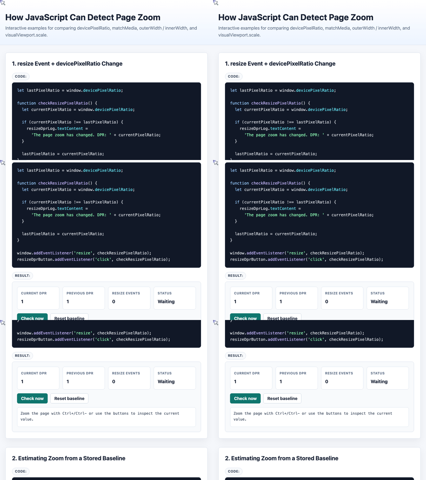
🎮 Try it live: Open the interactive demo to experience this yourself.
The weakness is that this does not reliably tell you the real zoom percentage. It tells you that the device pixel ratio changed.
That distinction matters. If the browser was already zoomed when the user first opened the page, you may not know the real baseline.
Estimating Zoom from a Stored Baseline
A slightly more advanced version stores an initial devicePixelRatio value and compares future values against it.
This can estimate the zoom ratio:
let originPixelRatio = localStorage.devicePixelRatio;

if (!originPixelRatio) {
  originPixelRatio = window.devicePixelRatio;

  if (Number.isInteger(originPixelRatio)) {
    localStorage.devicePixelRatio = originPixelRatio;
  }
}

originPixelRatio = Number(originPixelRatio);

function estimateStoredZoom() {
  let currentPixelRatio = window.devicePixelRatio;
  let zoom = Math.round(
    1000 * (currentPixelRatio / originPixelRatio)
  ) / 10;

  storedZoomResult.textContent = 'The zoom ratio is: ' + zoom + '%';
}

window.addEventListener('resize', estimateStoredZoom);
storedZoomButton.addEventListener('click', estimateStoredZoom);
This approach works well enough in many desktop situations, especially when the user first visits at normal zoom.
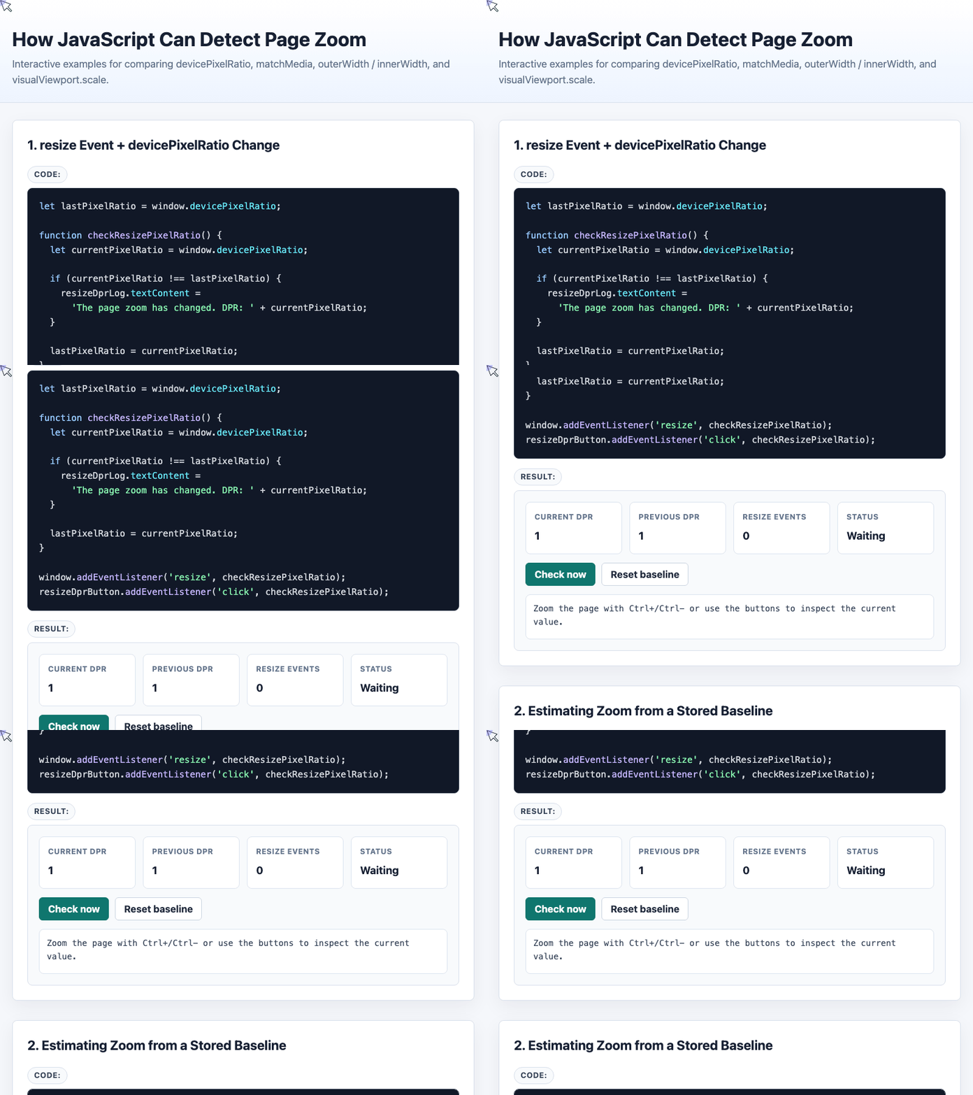
🎮 Try it live: Open the interactive demo to experience this yourself.
But it is still an estimate. If the first visit happens while the page is already zoomed, the stored baseline may be wrong.
2. A More Targeted Desktop Method: matchMedia() with dppx
Using resize works, but resize fires for many reasons: resizing the window, rotating a device, opening developer tools, or changing browser UI.
A more focused approach is to watch the current resolution using a media query:
let mediaOriginPixelRatio = window.devicePixelRatio;
let mediaQueryList;

function mediaPixelRatioChanged() {
  let currentPixelRatio = window.devicePixelRatio;
  let zoom = Math.round(
    1000 * (currentPixelRatio / mediaOriginPixelRatio)
  ) / 10;

  matchMediaResult.textContent = 'The zoom ratio is: ' + zoom + '%';

  mediaQueryList.removeEventListener('change', mediaPixelRatioChanged);

  mediaQueryList = matchMedia(
    '(resolution: ' + currentPixelRatio + 'dppx)'
  );

  mediaQueryList.addEventListener('change', mediaPixelRatioChanged);
}

mediaQueryList = matchMedia(
  '(resolution: ' + mediaOriginPixelRatio + 'dppx)'
);

mediaQueryList.addEventListener('change', mediaPixelRatioChanged);
The important detail is that the listener must be rebound after each change.
Why? Because a media query like (resolution: 1dppx) fires when it changes from matching to not matching. But once it is already unmatched, further zoom changes may not trigger another event. Rebuilding the query around the new devicePixelRatio keeps detection active.
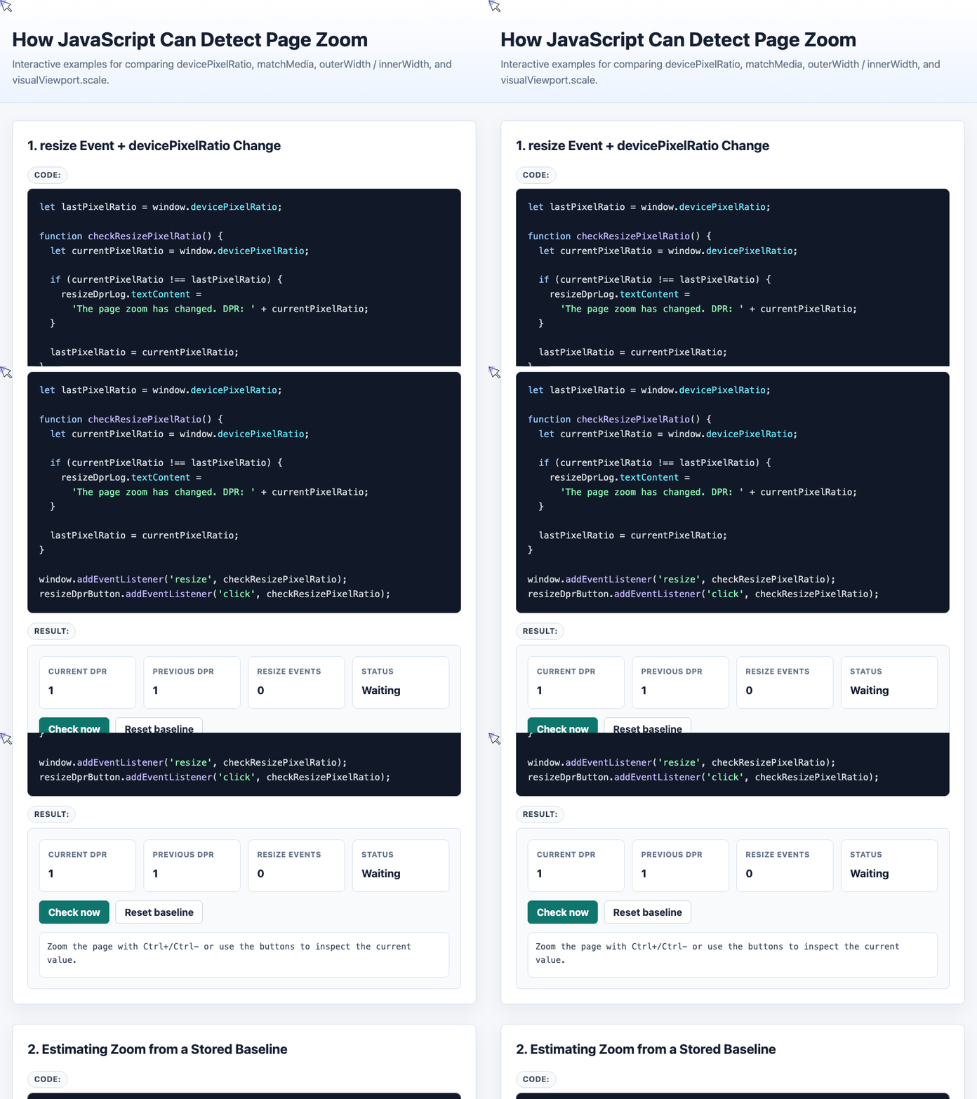
🎮 Try it live: Open the interactive demo to experience this yourself.
For desktop zoom detection, this is usually cleaner than listening to every resize event.
3. The outerWidth / innerWidth Shortcut
Another possible estimate is:
window.outerWidth / window.innerWidthThe idea is simple: compare the full browser window width with the page viewport width.
This can appear to work in Chrome and Safari, but it has serious limitations. Browser sidebars, docked developer tools, bookmarks panels, and custom browser UI can all shrink innerWidth without any page zoom happening.
So this method is best treated as a rough cross-check, not a primary detection strategy.
It also behaves inconsistently across browsers. In Firefox, for example, the relationship between page zoom and innerWidth may not produce the result you expect.
4. Mobile Pinch Zoom: Use visualViewport.scale
Desktop zoom and mobile pinch zoom are different things.
For mobile gesture zoom, the most direct API is:
function showGestureZoom() {
  if (!window.visualViewport) {
    visualViewportResult.textContent = 'visualViewport is not supported.';
    viewportScale.textContent = 'N/A';
    return;
  }

  visualViewportResult.textContent =
    'Gesture zoom ratio: ' + window.visualViewport.scale;

  viewportScale.textContent = window.visualViewport.scale;
}

if (window.visualViewport) {
  window.visualViewport.addEventListener('resize', showGestureZoom);
}

visualViewportButton.addEventListener('click', showGestureZoom);
On desktop browser zoom, visualViewport.scale often remains 1. That is expected. It is mainly useful for detecting the scale of the visual viewport during gesture zoom, especially on mobile browsers.
For mobile projects, this is the method to reach for first.
Which Method Should You Use?
Here is the practical decision table:
| Method | Best For | Main Problem |
|---|---|---|
resize + devicePixelRatio | Detecting desktop zoom changes | Cannot always know true baseline |
Stored devicePixelRatio baseline | Estimating desktop zoom percentage | Wrong if first visit was already zoomed |
matchMedia('(resolution: ...dppx)') | More targeted desktop DPR detection | Requires rebinding after each change |
outerWidth / innerWidth | Rough desktop cross-check | Breaks with sidebars/devtools/browser chrome |
visualViewport.scale | Mobile pinch zoom | Usually not useful for desktop zoom |
Final Recommendation
If you are building for desktop browsers, detect changes in window.devicePixelRatio. Use matchMedia() if you want a more focused listener than resize.
If you need an estimated zoom percentage, compare the current devicePixelRatio against a stored baseline, but treat the result as approximate.
If you are building for mobile pinch zoom, use window.visualViewport.scale.
And if you are tempted to rely on outerWidth / innerWidth, use it carefully. It can be useful as a supporting signal, but it is too fragile to trust on its own.
Try It Yourself
Want to see these concepts in action? I’ve created an interactive demo where you can experiment with the code and see real-time results.
Explore more demos from my previous articles in the Demo Gallery.
Happy coding!