Originally published by zhangxinxu on March 15, 2022, under “JS Examples.” Source: Xin Space - Xin Life.
Audio playback looks simple until you need a real player: playlist navigation, playback speed, loop modes, mobile-friendly controls, custom styling, and a usable JavaScript API.
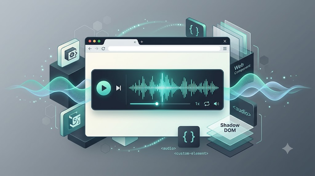
This project solves that problem with a Web Component: <ui-audio>. It wraps audio behavior behind a custom element whose API closely follows the native <audio> element, while adding practical controls such as previous/next playback, speed switching, loop modes, slots, and theme customization.
The original component depends on howler.js, a mature audio library that prioritizes the Web Audio API and falls back where needed.
Quick Start
The component is designed to be used like native HTML. Import one JavaScript file, then place <ui-audio> in your page.
<script type="module" src="./src/ui-audio.js"></script>

<ui-audio src="your.mp3" label="My audio track" controls></ui-audio>
The generated demo uses local Web Audio tones instead of external files, but the usage model mirrors the original component:
<ui-audio src="tone:major" label="Major arpeggio" controls></ui-audio>
The important idea is that playback is declarative. You can configure the player through attributes first, then progressively enhance it with JavaScript only when needed.
Attribute-Based Playback Control
The component supports many familiar audio concepts as HTML attributes:
src: current audio URLcontrols: whether the visual player is shownmuted: whether playback starts mutedloop: playback modeprevsrc: previous track URLnextsrc: next track URLlabel: visible title or descriptionmode: playback backend, such aswebapiorhtml5
For playlist-style playback, prevsrc and nextsrc are especially useful. The player can expose previous and next buttons based on whether these attributes exist.
<ui-audio
  src="tone:major"
  prevsrc="none"
  nextsrc="tone:minor"
  label="Track 1: Major"
  controls>
</ui-audio>
Here, prevsrc="none" disables the previous button, while nextsrc="tone:minor" allows the player to advance to another track. In a real playlist, your application would update these values according to the current track index, random mode, or repeat mode.
JavaScript Properties and Methods
For interactive applications, the component also exposes JavaScript properties and methods that feel close to the native <audio> API.
Common properties include:
currentTimevolumeplaybackRatepaused
Common methods include:
play()pause()stop()prev()next()load()unload()
The demo shows how external buttons can control the component directly:
<ui-audio
  id="methodDemo"
  src="tone:bright"
  label="Controlled by JavaScript"
  controls>
</ui-audio>

<button id="playDemo">play()</button>
<button id="pauseDemo">pause()</button>
<button id="stopDemo">stop()</button>
<button id="fasterDemo">playbackRate = 1.5</button>

<script>
const audio = document.querySelector('#methodDemo');

document.querySelector('#playDemo').addEventListener('click', () => audio.play());
document.querySelector('#pauseDemo').addEventListener('click', () => audio.pause());
document.querySelector('#stopDemo').addEventListener('click', () => audio.stop());

document.querySelector('#fasterDemo').addEventListener('click', () => {
  audio.playbackRate = 1.5;
});
</script>
This pattern is useful when the audio player is part of a larger interface: a lesson page, podcast app, music preview list, audiobook reader, or background audio controller.
Listening to Player Events
The component emits events such as:
playpauseloadendstopseekplayingerror
That makes it possible to log user behavior, sync UI state, update analytics, or trigger playlist changes.
const eventAudio = document.querySelector('#eventDemo');
const eventLog = document.querySelector('#eventLog');

['play', 'pause', 'seek', 'end', 'stop', 'load', 'error'].forEach((type) => {
  eventAudio.addEventListener(type, (event) => {
    const detail = event.detail ? `: ${event.detail}` : '';
    eventLog.prepend(`${type}${detail}\n`);
  });
});
This is one of the strongest reasons to wrap playback in a component. Your application code does not need to know every internal detail of how audio is loaded or rendered. It only reacts to a stable event contract.
Styling with CSS Variables and ::part()
Because the component uses Shadow DOM, normal page CSS cannot freely reach into every internal element. That is usually a good thing: component styles stay isolated.
But customization still matters. The component exposes CSS variables and named Shadow DOM parts.
For simple themes, CSS variables are enough:
.skin-blue {
  --ui-audio-background: #e0f2fe;
  --ui-audio-color: #0f172a;
  --ui-audio-accent: #0369a1;
}
<ui-audio
  class="skin-blue"
  src="tone:major"
  label="CSS variable skin"
  controls>
</ui-audio>
For more precise styling, use ::part():
.skin-red::part(container) {
  background: #7f1d1d;
  color: #fff;
  border-color: #fecaca;
}
The original component exposes parts such as:
ui-audio::part(container) {}
ui-audio::part(label) {}
ui-audio::part(operate) {}
This gives you a clean balance: Shadow DOM encapsulation by default, with intentional styling hooks when you need them.
Extending the Player with Slots
The component also provides a custom slot, allowing developers to inject extra markup into the player layout.
<ui-audio src="tone:bright" label="Slot example" controls>
  <span class="slot-credit" slot="custom">by zhangxinxu</span>
</ui-audio>
Because the player uses flex layout, the slotted element can be repositioned with CSS, such as order, without changing the component internals.
This is especially useful for credits, badges, metadata, or compact actions that belong visually inside the player but should remain owned by the page.
Why howler.js?
The original implementation uses howler.js because it provides a reliable abstraction over browser audio behavior. It works well with the Web Audio API, exposes practical playback controls, and avoids many browser-level inconsistencies.
For a custom audio component, that matters. The component should focus on API design, UI behavior, styling, and playlist logic. The lower-level playback engine should be stable and battle-tested.
Final Thoughts
This audio player is a useful example of how Web Components can package real interface behavior into a reusable HTML element.
The strongest design choice is API familiarity: if you already understand <audio>, you can understand <ui-audio>. From there, the component adds what native audio does not provide out of the box: playlist controls, playback modes, style hooks, slots, and a clean event surface.
It is a practical pattern for building reusable frontend components: start with native platform conventions, extend only where real product needs appear, and expose the right hooks for application code.
Try It Yourself
Want to see these concepts in action? I’ve created an interactive demo where you can experiment with the code and see real-time results.
Explore more demos from my previous articles in the Demo Gallery.
Happy coding!