But is it actually that awesome?
Let’s take a closer look.
The Starting Point: Most Click Interactions Are State Toggles
If we strip many common click interactions down to their essence, they often look like either radio selection or checkbox selection.
Tabs are a radio-selection pattern: only one tab can be active at a time. Expand/collapse panels, dropdowns, popups, and sidebars are checkbox-selection patterns: something is either open or closed. Tree structures and option lists can often be modeled as multiple checkboxes.
That means a surprising number of interactions can already be implemented with native radio or checkbox controls plus CSS’s :checked pseudo-class.
The classic version looks like this:
#limitOne:checked ~ .limited-panels .panel-one,
#limitTwo:checked ~ .limited-panels .panel-two {
  display: block;
}
This is elegant, but it comes with a structural limitation: + and ~ can only select following sibling elements. The input and the thing it controls must live in a carefully arranged DOM hierarchy.
That is where things begin to feel awkward.
The Real Problem: The DOM Has to Bend Around the Selector
The usual workaround is to use a <label> with a for attribute. Since clicking a label can toggle or select its associated input, the input can be placed somewhere else on the page.
Functionally, this works. Structurally, it often becomes strange.
For a tab interface, for example, the tab buttons and tab panels may need to share an artificial wrapper just so the CSS selectors can reach the right elements. The HTML starts serving the selector instead of the document structure.
That led to the sudden thought:
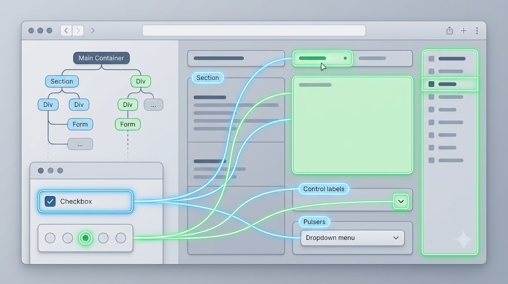
What if any element on the page could respond to the checked state of a radio or checkbox, as long as it was associated with that input?
In other words:
<ul class="option-list">
  <li for="item1"><input type="radio" id="item1" name="item" checked>Option 1</li>
  <li for="item2"><input type="radio" id="item2" name="item">Option 2</li>
  <li for="item3"><input type="radio" id="item3" name="item">Option 3</li>
</ul>
If #item2 becomes checked, every element with for="item2" gets an .active class. If it becomes unchecked, .active is removed.
Then CSS becomes simple again:
.option-list li.active {
  color: white;
  background: #0f766e;
  border-color: #0f766e;
}
This is the core idea behind smart-for.js: preserve the native behavior of radio buttons and checkboxes, then synchronize that state to any associated element.
The Rule: Match for to id
The mental model is intentionally similar to native labels:
- The input has an
id. - Any element that wants to mirror that input’s state uses a matching
forattribute. - When the input is checked, the matching elements receive
.active. - When the input is unchecked,
.activeis removed.
This gives us a general-purpose interaction layer. The JavaScript does not know whether we are building tabs, sidebars, dropdowns, or selection lists. It only knows how to synchronize checked state.
Example: A Sidebar Powered by One Checkbox
A sidebar is naturally a checkbox interaction: open or closed.
Here is the essential HTML:
<label class="ui-button">
  <input type="checkbox" id="zxxAside" hidden>
  Click me to show the sidebar
</label>

<aside class="aside" for="zxxAside">
  <label for="zxxAside" class="aside-overlay"></label>
  <div class="aside-content">
    Click the black overlay to collapse
  </div>
</aside>
The checkbox is hidden inside a visible label. Clicking the label toggles the checkbox. The <aside> listens to that checkbox through for="zxxAside".
The CSS only needs to care about .active:
.aside {
  visibility: hidden;
}

.aside.active {
  visibility: visible;
}

.aside.active .aside-content {
  transform: translateX(0);
}
The overlay is also a label pointing to the same checkbox, so clicking it unchecks the control and closes the sidebar. No business-specific JavaScript is needed.
Example: Tabs Without Strange Hierarchy
Tabs are just radio buttons: one selected item in a group.
With state synchronization, the tab buttons and panels can be organized in a normal structure:
<input class="tab-radios" type="radio" id="tabIdea" name="tabs" checked>
<input class="tab-radios" type="radio" id="tabDemo" name="tabs">
<input class="tab-radios" type="radio" id="tabCaveat" name="tabs">

<nav class="tab-nav">
  <label for="tabIdea">Idea</label>
  <label for="tabDemo">Demo</label>
  <label for="tabCaveat">Caveat</label>
</nav>

<section class="tab-panel" for="tabIdea">The idea panel.</section>
<section class="tab-panel" for="tabDemo">The demo panel.</section>
<section class="tab-panel" for="tabCaveat">The caveat panel.</section>
And the styling is predictable:
.tab-nav label.active {
  background: #0f766e;
  color: white;
}

.tab-panel {
  display: none;
}

.tab-panel.active {
  display: block;
}
The tab label and tab panel both point to the same radio input. When that radio is checked, both become active.
The Synchronization Engine
The interesting part is not toggling a class. The hard part is noticing every way a checked state can change.
A radio or checkbox can change because:
- The user clicks it.
- A label associated with it is clicked.
- JavaScript assigns
input.checked = true. - Code calls
setAttribute('checked', '')orremoveAttribute('checked'). - Another radio in the same group becomes checked.
- New inputs or associated elements are inserted into the DOM.
A compact version of the synchronization logic looks like this:
(function () {
  var selector = 'input[type="radio"], input[type="checkbox"]';

  function sync(input) {
    if (!input || !input.id || !input.matches(selector)) return;

    if (input.type === 'radio' && input.name) {
      document
        .querySelectorAll('input[type="radio"][name="' + CSS.escape(input.name) + '"]')
        .forEach(syncOne);
    } else {
      syncOne(input);
    }
  }

  function syncOne(input) {
    document
      .querySelectorAll('[for="' + CSS.escape(input.id) + '"]')
      .forEach(function (node) {
        if (node !== input) {
          node.classList.toggle('active', input.checked);
        }
      });
  }

  document.addEventListener('change', function (event) {
    if (event.target.matches(selector)) {
      sync(event.target);
    }
  });

  document.querySelectorAll(selector).forEach(sync);
})();
This handles the basic case: when a checkbox or radio changes, all matching [for] elements update.
For a more complete implementation, we also need to intercept scripted .checked assignments:
var checked = Object.getOwnPropertyDescriptor(
  HTMLInputElement.prototype,
  'checked'
);

Object.defineProperty(HTMLInputElement.prototype, 'checked', {
  get: checked.get,
  set: function (value) {
    checked.set.call(this, value);
    sync(this);
  }
});
And to handle DOM or attribute changes, we can use MutationObserver:
new MutationObserver(function (records) {
  records.forEach(function (record) {
    if (record.type === 'attributes') {
      sync(record.target);
    }

    document.querySelectorAll(selector).forEach(sync);
  });
}).observe(document.documentElement, {
  childList: true,
  subtree: true,
  attributes: true,
  attributeFilter: ['checked', 'for', 'id', 'name']
});
At this point, the helper is no longer tied to a specific component. It becomes a small state synchronization layer.
Is This Better Than Pure CSS?
Sometimes, yes.
This approach is useful when:
- You want radio/checkbox-powered interactions.
- The controlled element cannot be placed after the input.
- You want the DOM structure to remain readable.
- You want one small helper instead of custom JavaScript for every interaction.
- You need broad compatibility and cannot rely on newer selector behavior.
But it is not magic.
The for attribute on non-label elements is not semantic HTML. It works as an attribute that JavaScript can read, but it does not suddenly give every element native label behavior. Accessibility still needs thought. For production components, ARIA roles, keyboard behavior, focus management, and semantic alternatives like <details>/<summary> may still be better.
For dropdowns, :focus-within is often cleaner. For disclosure widgets, <details> is usually the better native choice. For complex UI, explicit JavaScript can still be clearer.
The Real Value: One Rule, Many Interactions
The fascinating part is the abstraction.
Instead of writing different JavaScript for tabs, sidebars, dropdowns, and option lists, we define one rule:
checked state maps to active state.
Radio buttons and checkboxes already have stable native behavior. Labels already know how to toggle them. JavaScript only fills the missing gap: making unrelated elements respond to that native state.
That is why the idea feels powerful. It is not about removing JavaScript entirely. It is about writing a tiny piece of general JavaScript so many interactions no longer need their own custom scripts.
Final Thoughts
So, is synchronizing checked state across the page “seriously awesome”?
For certain UI patterns, yes. It removes DOM hierarchy restrictions, keeps CSS simple, and turns radio/checkbox state into a reusable interaction primitive.
But it should be used with judgment. It is best for lightweight interaction glue, campaign pages, demos, internal tools, and cases where the native input model already matches the behavior.
A sudden Sunday thought can be surprisingly productive. This one turns out to be more than a trick: it is a reminder that browser-native behavior is often powerful enough. Sometimes the best JavaScript is not the code that controls every interaction directly, but the code that lets the browser’s own interaction model travel a little farther.
Try It Yourself
Want to see these concepts in action? I’ve created an interactive demo where you can experiment with the code and see real-time results.
Explore more demos from my previous articles in the Demo Gallery.
Happy coding!