CSS custom properties are usually introduced as reusable values:
:root {
  --brand-color: #0f766e;
}
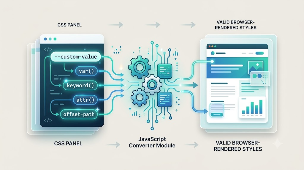
But they are more powerful than that. A custom property can store almost any token sequence, including syntax the browser would normally reject if it appeared directly in a real CSS property.
That makes var() useful as a kind of custom syntax middleware: CSS carries the experimental syntax, JavaScript reads it, converts it, and writes back something the browser already understands.
This article walks through three practical examples:
- A custom
keyword()color function - A polyfill-style
offset-pathsyntax - A runtime implementation of typed
attr()
The Core Trick
Browsers reject invalid property values:
body {
  color: keyword(red, 50%);
}
The color property does not understand keyword(), so the declaration is invalid.
But this is valid:
body {
  --keyword: keyword(red, 50%);
  color: var(--keyword);
}
The browser accepts the custom property because custom properties are intentionally permissive. JavaScript can then read --keyword, parse the custom syntax, and replace the final visual value with something legal, such as rgba(255, 0, 0, 0.5).
That gives us a pattern:
.element {
  --custom-value: some-new-syntax(anything);
  property: var(--custom-value);
}
JavaScript becomes the translation layer between author-friendly experimental syntax and browser-supported CSS.
1. Inventing a keyword() Color Function
CSS supports many color syntaxes, but named colors cannot directly express transparency. You can write red, and you can write rgba(255, 0, 0, 0.5), but you cannot write something like this natively:
color: keyword(red, 50%);
Using a custom property, however, we can make that syntax survive parsing.
Here is the author-facing CSS from the demo:
.keyword-card {
  --keyword: keyword(blue, 50%);
  --aaa: keyword(blue, 0.1);
  --bbb: var(--aaa);

  color: var(--keyword);
  background-color: var(--bbb);
}
The important detail is that both keyword() values are stored in custom properties first. Even nested custom properties work: --bbb points to --aaa, and JavaScript can resolve and convert the final value.
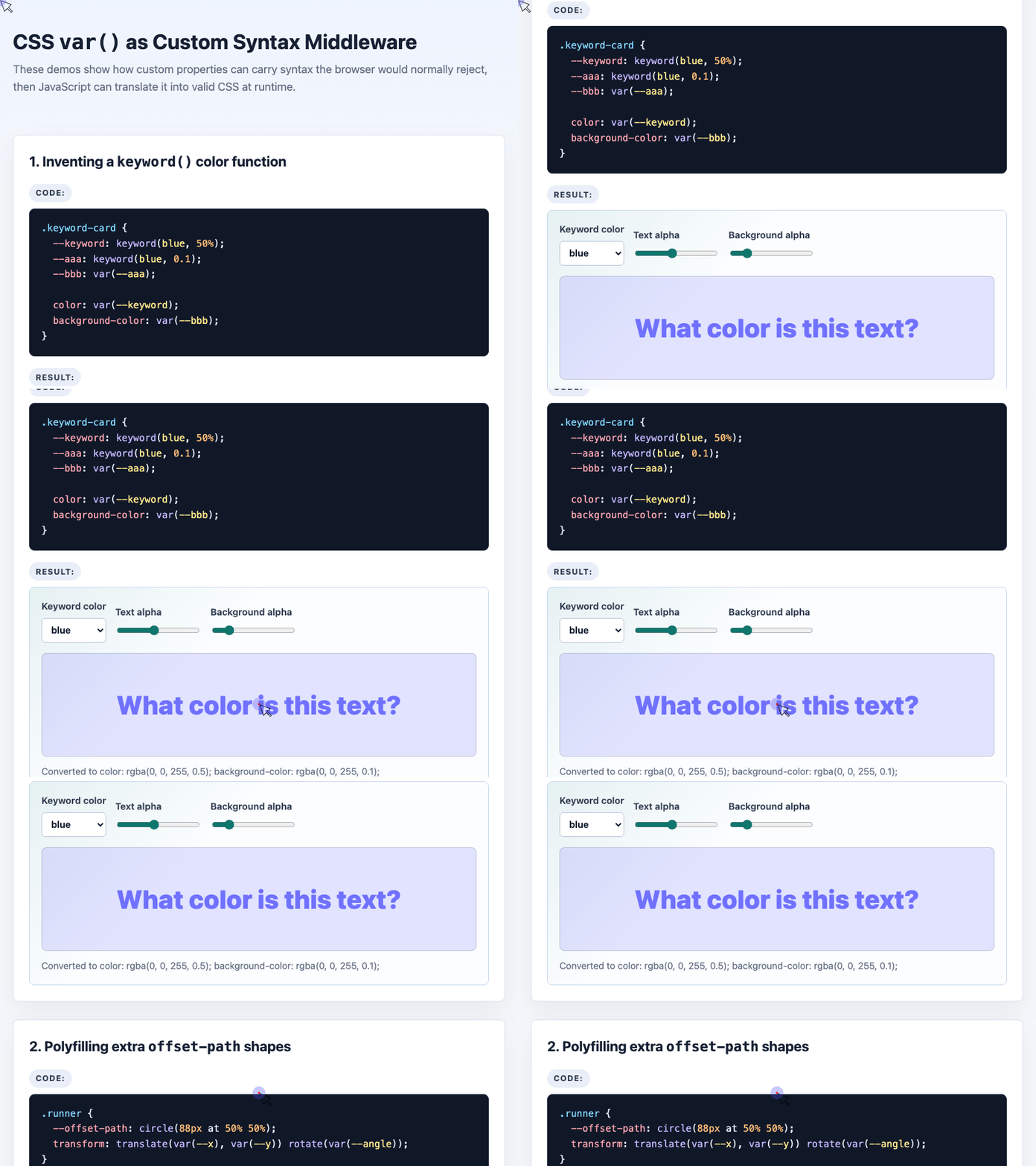
🎮 Try it live: Open the interactive demo to experience this yourself.
Now the runtime conversion can stay small and focused:
const namedColors = {
  red: [255, 0, 0],
  blue: [0, 0, 255],
  green: [0, 128, 0],
  purple: [128, 0, 128],
  orange: [255, 165, 0]
};

function parseAlpha(value) {
  const trimmed = String(value).trim();
  return trimmed.endsWith("%")
    ? parseFloat(trimmed) / 100
    : parseFloat(trimmed);
}

function keywordToRgba(value) {
  const match = value.match(/keyword\(\s*([a-z]+)\s*[,/]\s*([^)]+)\)/i);
  if (!match) return value;

  const rgb = namedColors[match[1].toLowerCase()] || [0, 0, 0];
  const alpha = Math.max(0, Math.min(1, parseAlpha(match[2])));

  return `rgba(${rgb[0]}, ${rgb[1]}, ${rgb[2]}, ${alpha})`;
}
This function accepts both percentage and decimal alpha values, clamps the result between 0 and 1, and outputs standard rgba().
The browser never needed to understand keyword() directly. It only needed to preserve the custom property long enough for JavaScript to translate it.
2. Polyfilling Unsupported offset-path Shapes
The same idea becomes more powerful when we use it as a polyfill strategy.
Modern CSS motion paths support offset-path: path(...), but the broader specification includes other shapes too, such as:
offset-path: circle(50% at 25% 25%);
offset-path: ellipse(50% 40px at top);
offset-path: inset(50% 50% 50% 50%);
offset-path: polygon(30% 0%, 70% 0%, 30% 100%);
offset-path: url(#somePathId);
Browser support for these forms has historically lagged behind the specification. A preprocessor cannot solve that, because the browser still needs runtime layout information and live DOM access.
Custom properties can help.
In the demo, the CSS stores the desired motion syntax in --offset-path:
.runner {
  --offset-path: circle(88px at 50% 50%);

  transform:
    translate(var(--x, 88px), var(--y, 0))
    rotate(var(--angle, 0deg));
}
Instead of relying on native offset-path support for every shape, JavaScript reads the custom value and writes ordinary transform coordinates.
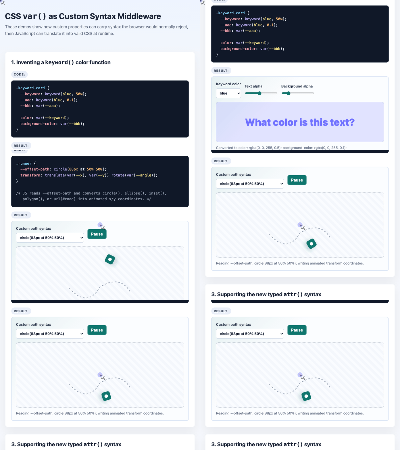
🎮 Try it live: Open the interactive demo to experience this yourself.
The parser can branch based on the function name:
function parsePathSyntax(value) {
  if (value.startsWith("circle")) {
    const radius = Number(value.match(/circle\((\d+)px/)?.[1] || 88);

    return t => {
      const angle = t * Math.PI * 2;

      return {
        x: Math.cos(angle) * radius,
        y: Math.sin(angle) * radius,
        angle: angle * 180 / Math.PI
      };
    };
  }

  if (value.startsWith("ellipse")) {
    const match = value.match(/ellipse\((\d+)px\s+(\d+)px/);
    const rx = Number(match?.[1] || 130);
    const ry = Number(match?.[2] || 70);

    return t => {
      const angle = t * Math.PI * 2;

      return {
        x: Math.cos(angle) * rx,
        y: Math.sin(angle) * ry,
        angle: angle * 180 / Math.PI
      };
    };
  }
}
This snippet returns a sampler function. Given a progress value t from 0 to 1, it returns the current x, y, and rotation angle.
Then animation becomes straightforward:
function animateRunner(now) {
  const t = ((now - started) / 3600) % 1;
  const point = sampler(t);

  runner.style.setProperty("--x", `${point.x}px`);
  runner.style.setProperty("--y", `${point.y}px`);
  runner.style.setProperty("--angle", `${point.angle}deg`);

  requestAnimationFrame(animateRunner);
}
This is not a full browser implementation of offset-path, but it demonstrates the practical polyfill shape: preserve unsupported CSS syntax in a custom property, parse it, and map it onto supported CSS primitives.
3. Supporting Typed attr() Syntax
The new typed attr() syntax is one of the most interesting future-facing CSS features. It allows HTML attributes to provide typed CSS values:
button {
  background-color: attr(bgcolor color);
  border-radius: attr(radius px, 4px);
}
In theory, this would let HTML and CSS communicate much more directly. In practice, broad support has been limited, so we can use the same var() middleware trick.
The demo writes the unsupported attr() calls into custom properties:
.attr-button {
  --attr-bg: attr(bgcolor color);
  --attr-radius: attr(radius px, 4px);

  background-color: var(--attr-bg);
  border-radius: var(--attr-radius);
}
And the HTML supplies the values:
<button class="attr-button" bgcolor="#b42318" radius="18">
  Attribute powered
</button>
JavaScript can then read the attributes and apply the supported CSS values directly:
function applyAttrDemo() {
  const button = document.getElementById("attrButton");

  const color = document.getElementById("attrColor").value || "#b42318";
  const radius = document.getElementById("attrRadius").value || "4";

  button.setAttribute("bgcolor", color);
  button.setAttribute("radius", radius);

  button.style.backgroundColor = button.getAttribute("bgcolor");
  button.style.borderRadius = `${button.getAttribute("radius") || 4}px`;
}
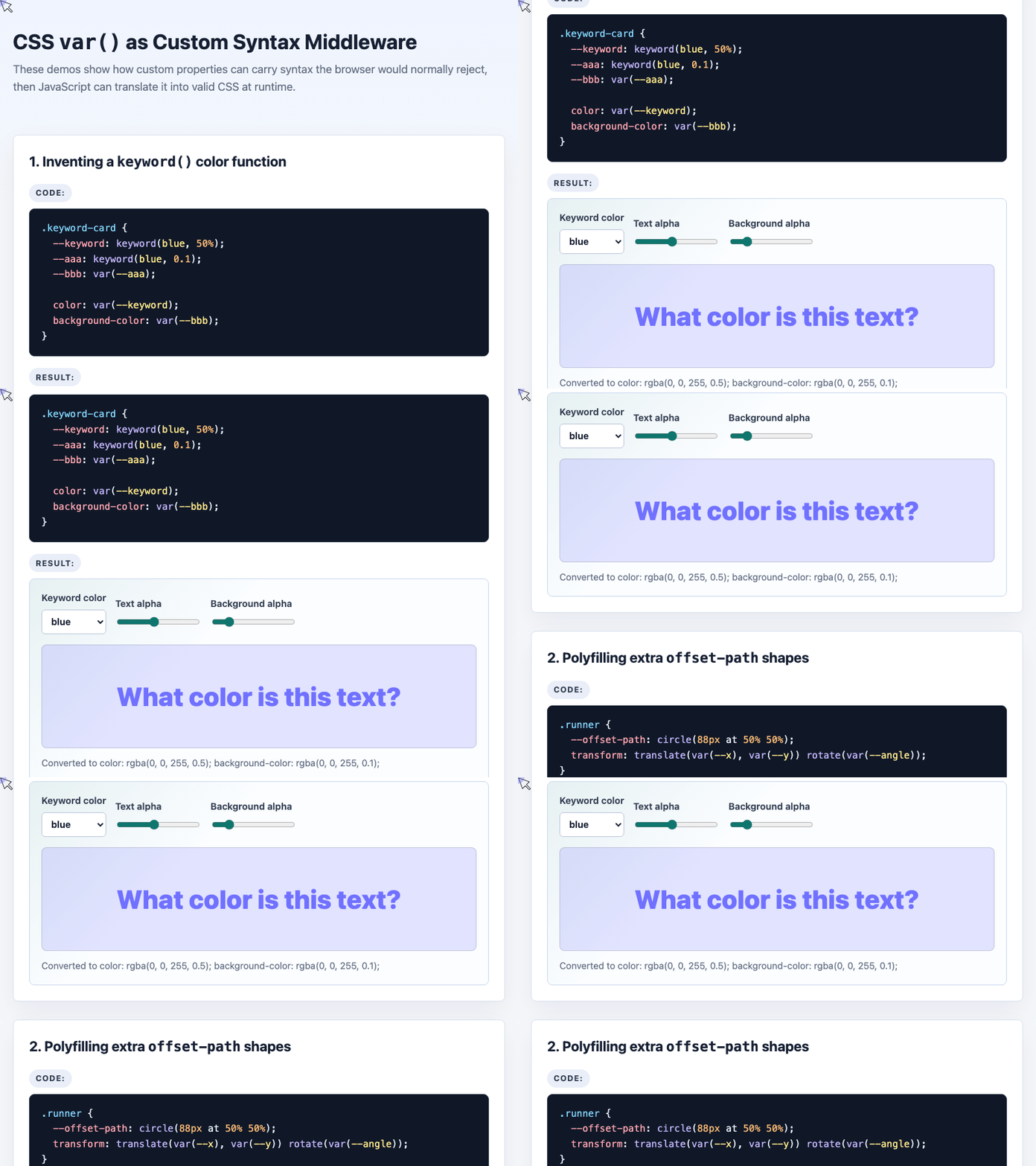
🎮 Try it live: Open the interactive demo to experience this yourself.
This gives authors a way to experiment with future CSS ergonomics today, while still outputting ordinary supported CSS at runtime.
Why This Works
The technique works because custom properties are parsed differently from normal CSS properties.
A normal property has a grammar. If its value does not match that grammar, the browser drops the declaration.
A custom property is different. The browser stores the token sequence almost as-is. It does not need to know whether keyword(), circle(), or typed attr() is meaningful. It only needs to preserve the value.
That gives JavaScript access to author-written syntax that would otherwise disappear during CSS parsing.
When This Technique Makes Sense
This approach is useful when:
- You want to experiment with proposed CSS syntax
- You need runtime DOM information that a preprocessor cannot know
- You want graceful progressive enhancement
- You are building a narrow polyfill for a specific project need
- You want to keep author-facing CSS expressive and declarative
It is less useful when a build-time preprocessor can solve the problem completely. For example, converting keyword(red, 50%) to rgba(255, 0, 0, 0.5) can be done by Sass, Less, PostCSS, or a custom Node.js transform.
But a runtime feature like reading url(#road) from the current document, resolving attributes, or animating based on live state needs JavaScript.
Final Thoughts
CSS custom properties are not just variables. They are also a transport layer for syntax.
By placing experimental or custom syntax inside --properties, we can let the browser preserve values it would normally reject. JavaScript can then read those values, parse them, and convert them into standard CSS.
The three examples in this article all use the same principle:
- Write custom syntax into a CSS variable
- Reference it with
var() - Read the custom property in JavaScript
- Convert it into browser-supported CSS
Used carefully, this technique gives us a practical way to prototype future CSS ideas, create small polyfills, and design more expressive author-facing styles today.
Try It Yourself
Want to see these concepts in action? I’ve created an interactive demo where you can experiment with the code and see real-time results.
Explore more demos from my previous articles in the Demo Gallery.
Happy coding!