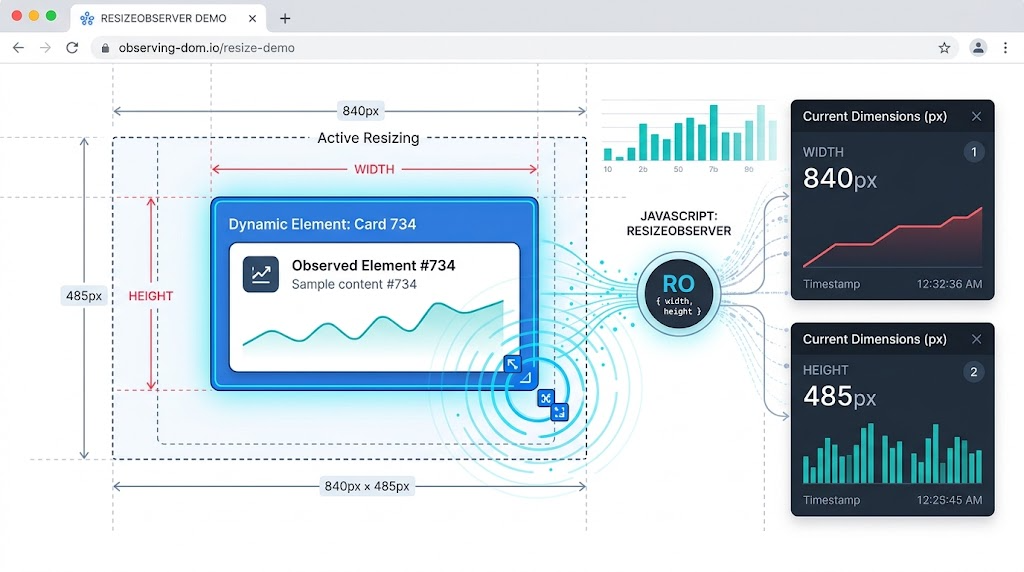
MutationObserver is useful when you need to detect changes to DOM nodes, attributes, or text content. But for a long time, detecting size changes was less direct. Developers often listened to the resize event on window, even when the actual thing they cared about was a single element.
That approach is imprecise. A window can resize without a specific element changing size. An element can also resize without the window changing at all: dynamic content, CSS changes, flex/grid layout shifts, user-resizable textareas, and hidden/shown elements can all affect dimensions.
That is exactly the problem ResizeObserver solves.
What ResizeObserver Does
ResizeObserver lets you observe one or more elements and run code when their rendered size changes.
A minimal example looks like this:
const resizeObserver = new ResizeObserver((entries) => {
  for (const entry of entries) {
    const rect = entry.contentRect;

    console.log('Element:', entry.target);
    console.log(`Size: ${rect.width}px x ${rect.height}px`);
  }
});

resizeObserver.observe(document.querySelector('#latest'));
The callback receives a list of observed entries. Each entry includes the element itself through entry.target, and its measured content box through entry.contentRect.
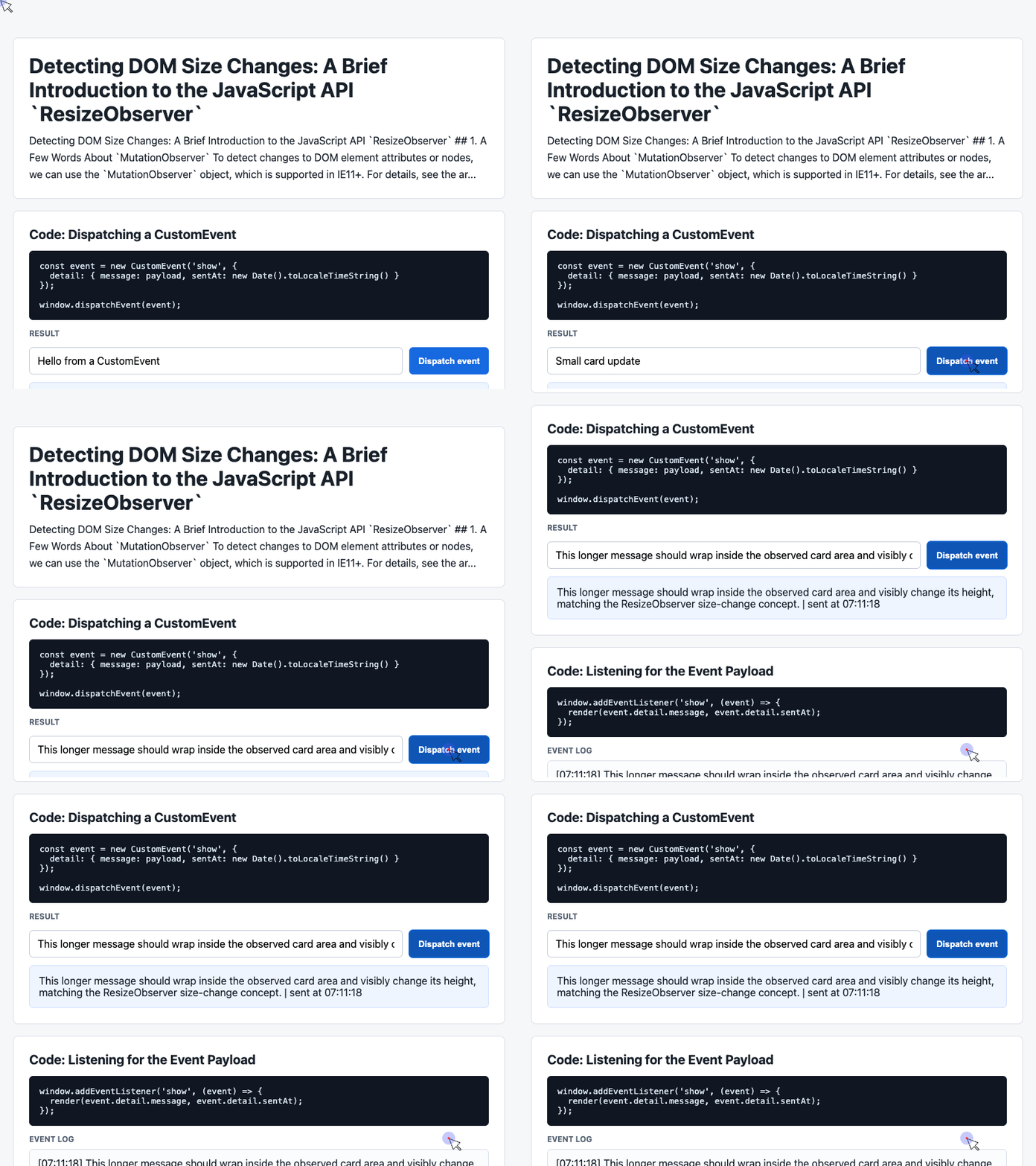
🎮 Try it live: Open the interactive demo to experience this yourself.
Building a Small Demo Surface
The provided demo uses a simple page structure with cards, controls, and a log area. That same structure works well for demonstrating ResizeObserver, because we need an element whose size can change and somewhere to display the result.
Here is the relevant HTML pattern:
<div class="showcase">
  <div class="controls">
    <input id="payload" value="Add more text to resize the card">
    <button id="dispatch">Update content</button>
  </div>

  <div class="event-card" id="latest">
    Waiting for a size change...
  </div>

  <div class="log" id="event-log">
    No resize events yet.
  </div>
</div>
The #latest element is the observed target. The input and button change its content, and the log records what ResizeObserver detects.
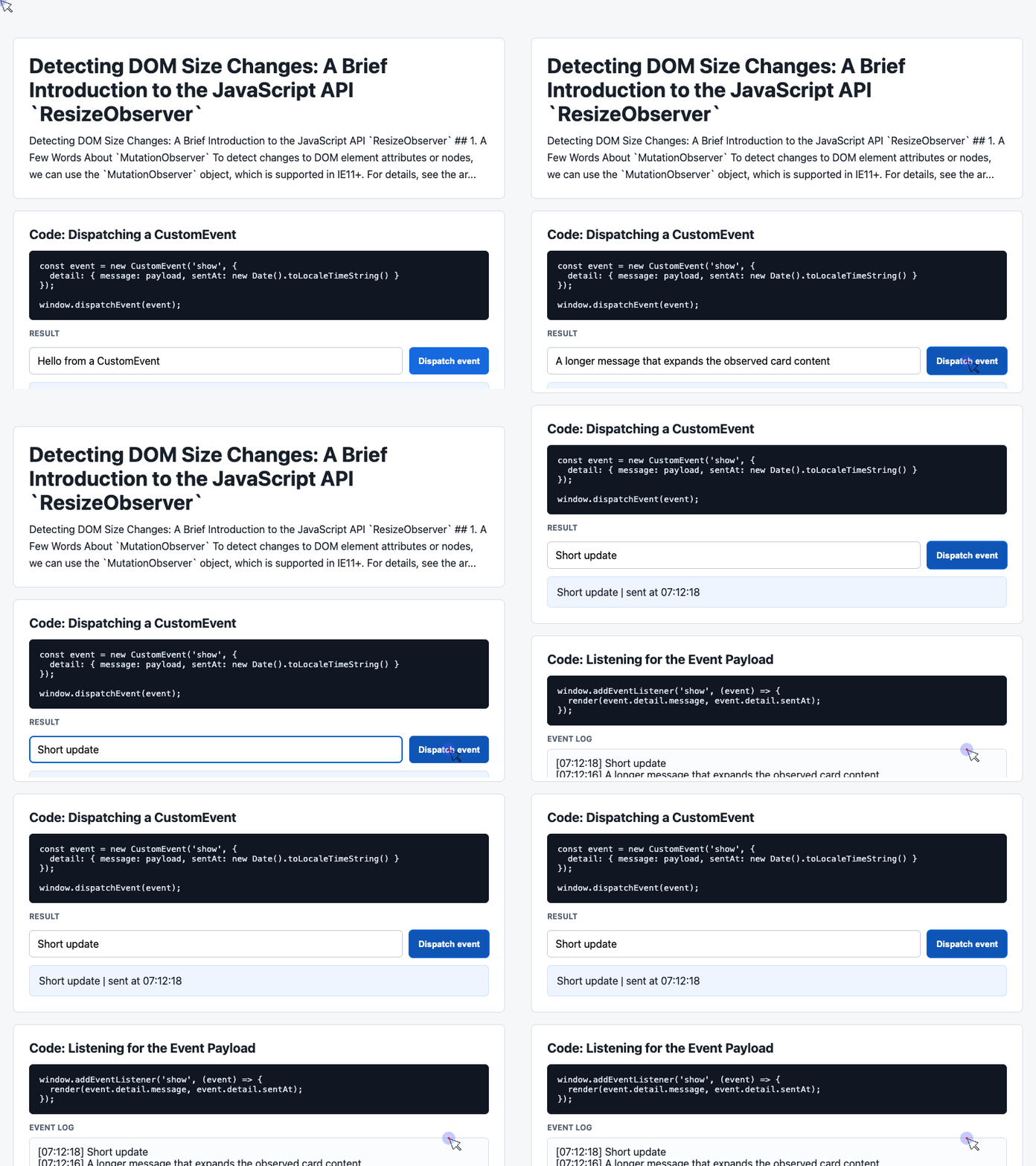
🎮 Try it live: Open the interactive demo to experience this yourself.
Styling the Observable Element
The demo’s CSS creates a clean visual container and makes the observed element easy to inspect:
.showcase {
  display: grid;
  gap: 12px;
  margin-top: 14px;
}

.event-card {
  border: 1px solid #cfe0ff;
  background: #eef5ff;
  border-radius: 6px;
  padding: 14px;
}

.log {
  min-height: 90px;
  border: 1px solid #d8dde7;
  background: #fbfcfe;
  border-radius: 6px;
  padding: 12px;
  white-space: pre-wrap;
}
The important detail is that .event-card does not have a fixed height. When its content changes, the browser can recalculate its layout, which gives ResizeObserver something meaningful to detect.
Connecting User Interaction to Size Observation
The original demo dispatches a CustomEvent. For a ResizeObserver demo, we can reuse the same input/button pattern but update the observed element’s content instead.
const input = document.querySelector('#payload');
const latest = document.querySelector('#latest');
const log = document.querySelector('#event-log');

const history = [];

document.querySelector('#dispatch').addEventListener('click', () => {
  const message = input.value.trim() || 'Default ResizeObserver message';
  latest.textContent = message.repeat(3);
});
Each click changes the content inside #latest. If the new text causes the card to wrap or grow, the observer callback will run.
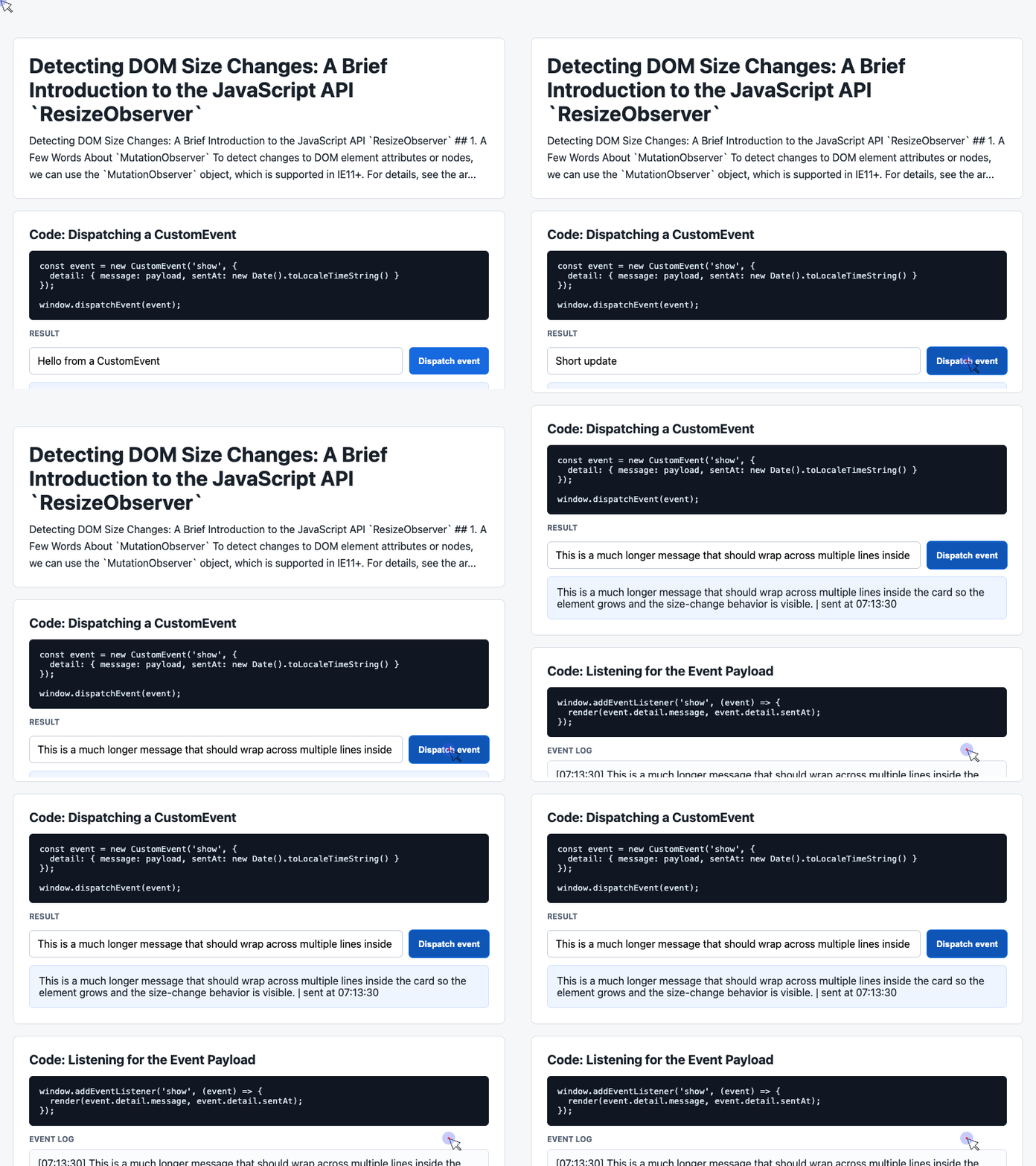
🎮 Try it live: Open the interactive demo to experience this yourself.
Logging Resize Events
Now we can observe the card and write size changes into the log area. This follows the same history-list pattern from the provided demo code:
const observer = new ResizeObserver((entries) => {
  const entry = entries[0];
  const rect = entry.contentRect;
  const time = new Date().toLocaleTimeString();

  history.unshift(
    `[${time}] ${Math.round(rect.width)}px x ${Math.round(rect.height)}px`
  );

  log.textContent = history.slice(0, 6).join('\n');
});

observer.observe(latest);
This example keeps the six most recent resize events. In real applications, you might use the same pattern to update layout state, trigger analytics, redraw a chart, or synchronize a component with its container size.
Understanding contentRect
entry.contentRect describes the element’s content box. It includes values such as:
{
  x: 0,
  y: 0,
  width: 296,
  height: 100,
  top: 0,
  right: 296,
  bottom: 100,
  left: 0
}
If an element has padding, the content box is measured inside that padding. That means contentRect.width and contentRect.height describe the usable content area, not necessarily the full visual size including padding and border.
Modern implementations may also expose box-size properties such as borderBoxSize and contentBoxSize, which are useful when you need more precise measurements across writing modes.
Practical Use Cases
ResizeObserver is useful whenever an element’s size matters independently of the viewport.
A few common examples:
- Detecting when a user resizes a
<textarea> - Re-rendering charts when their container changes size
- Updating responsive components inside grid or flex layouts
- Detecting when dynamic content expands a panel
- Observing whether an element becomes hidden through layout changes
For example, if an image is hidden because a sibling button receives a class, MutationObserver on the image may not help. The image itself did not change. Its rendered size did.
That is where ResizeObserver becomes a better fit.
Polyfill
If you need broader compatibility, the commonly used polyfill is:
https://github.com/juggle/resize-observer
For modern browsers, native support is now strong enough that many projects can use ResizeObserver directly.
Conclusion
ResizeObserver fills an important gap in the browser platform. MutationObserver tells you when the DOM changes. window.resize tells you when the viewport changes. ResizeObserver tells you when the element you actually care about changes size.
That makes it a better tool for modern component-driven interfaces, responsive layouts, dashboards, editors, charts, and any UI where layout changes are local rather than page-wide.
Try It Yourself
Want to see these concepts in action? I’ve created an interactive demo where you can experiment with the code and see real-time results.
Explore more demos from my previous articles in the Demo Gallery.
Happy coding!