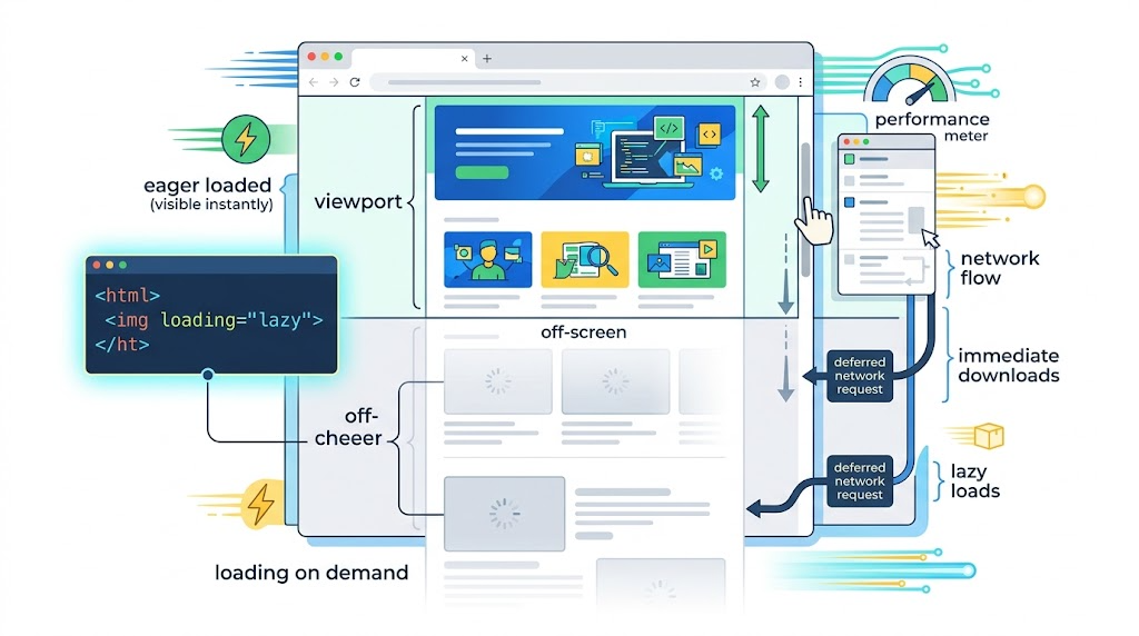
Native image lazy loading is one of those small HTML features that removes a surprising amount of JavaScript from everyday frontend work. Instead of watching scroll events, calculating viewport distance, swapping data-src into src, and tuning thresholds manually, modern browsers can defer image loading with a single attribute:
<img src="./example.jpg" loading="lazy" alt="Example image">When the image approaches the viewport, the browser decides when to fetch it. The result is simpler code, faster initial page loads, and fewer unnecessary image requests for content users may never see.
This guide walks through how native lazy loading behaves in practice, how to detect support, and how to build a small interactive demo interface around the concept.
Why Native Lazy Loading Matters
Before native lazy loading, image-heavy pages usually relied on JavaScript. Developers commonly stored the real image URL in data-src, observed scroll position, and then replaced data-src with src when the image was close enough to the viewport.
That approach works, but it comes with costs:
- More JavaScript on the page
- More layout and scroll logic to maintain
- More edge cases around resizing, fast scrolling, and browser restore behavior
- More chances to accidentally harm accessibility or SEO
With loading="lazy", the browser owns the timing.
The Core HTML Pattern
The native syntax is intentionally small. Add loading="lazy" to an image, keep a real src, and provide width, height, and alt text as usual.
<img
  src="./example.jpg"
  loading="lazy"
  alt="Demo image loaded lazily"
  width="250"
  height="150"
/>
The key detail is that the image still uses src. Native lazy loading does not require hiding the URL in data-src. That means the markup remains meaningful, accessible, and easier for browsers to reason about.
🎮 Try it live: Open the interactive demo to experience this yourself.
What Actually Triggers Lazy Loading?
Native lazy loading is not simply “load the next image when it enters the screen.” Browser behavior is more sophisticated.
In practice, lazy loading can be affected by:
- Viewport height
- Network speed
- Current scroll position
- Window resizing
- Browser restore behavior after refresh
For example, a tall viewport may cause more images to load initially than a short viewport. A slower network may also cause the browser to fetch more images earlier, reducing the chance that users see empty space while scrolling.
That means native lazy loading is not a precise replacement for every custom lazy-loading system. It is a browser-managed performance hint.
Building a Small Demo Shell
The provided demo code includes a clean article-style layout that works well for explaining technical behavior. The page uses a centered main container, readable typography, and separated sections.
Here is the relevant structure:
<main>
  <section>
    <h1>Browser Native Lazy Loading for IMG Images with `loading="lazy"`</h1>
    <p>
      A practical guide to native browser lazy loading for image-heavy pages.
    </p>
  </section>

  <section>
    <h2>Lazy Loading Demo</h2>
    <div class="showcase">
      <!-- Demo content goes here -->
    </div>
  </section>
</main>
This kind of layout is useful because native lazy loading is easiest to understand when readers can scroll through real content and watch network requests in DevTools.
🎮 Try it live: Open the interactive demo to experience this yourself.
Styling the Demo Area
The demo code also includes a simple, readable visual system. The important part is that the layout does not distract from the browser behavior being tested.
main {
  max-width: 920px;
  margin: 0 auto;
  padding: 40px 20px 56px;
}

section {
  background: #fff;
  border: 1px solid #d9dde5;
  border-radius: 8px;
  padding: 24px;
  margin-top: 18px;
}

.showcase {
  display: grid;
  gap: 12px;
  margin-top: 14px;
}
For a lazy-loading demo, this structure gives you enough vertical rhythm to place images down the page and observe when requests happen. It also keeps the test environment visually stable, which matters when you are watching resize and scroll behavior.
🎮 Try it live: Open the interactive demo to experience this yourself.
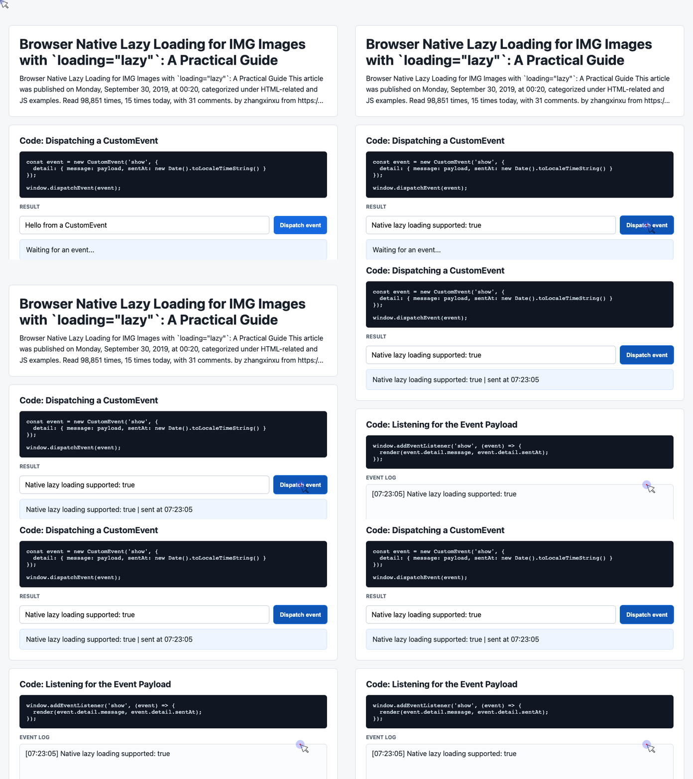
Detecting Browser Support
Native lazy loading should be feature-detected before relying on it for a fallback strategy.
The most common check is:
const supportsNativeLazyLoading =
  'loading' in HTMLImageElement.prototype;
If this returns true, the browser understands the loading property on image elements. If it returns false, you can use a traditional JavaScript lazy-loading fallback.
A practical strategy looks like this:
if ('loading' in HTMLImageElement.prototype) {
  document.querySelectorAll('img[data-src]').forEach((img) => {
    img.src = img.dataset.src;
    img.loading = 'lazy';
  });
} else {
  // Load a fallback lazy-loading script here.
}
This keeps modern browsers on the native path while still allowing older browsers to use a JavaScript fallback.
Using Events to Inspect Demo Behavior
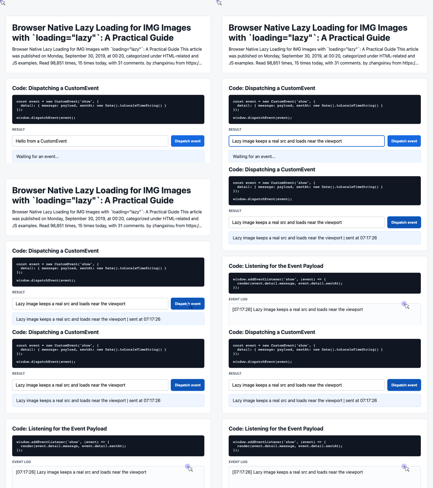
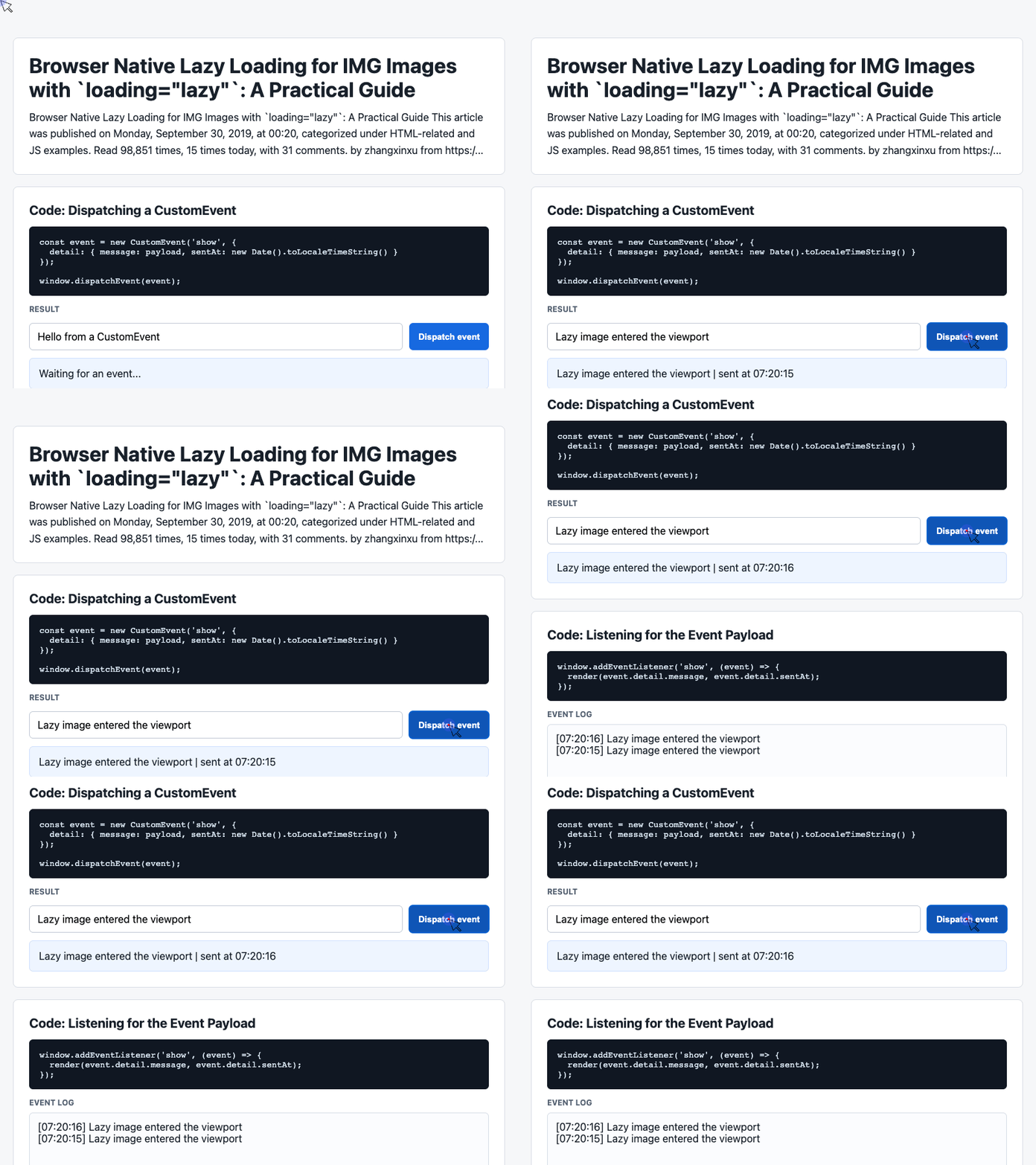
The provided demo code uses CustomEvent to send a payload through the page. While this is not required for native lazy loading, it is useful for building small technical demos where you want to log browser behavior.
const event = new CustomEvent('show', {
  detail: {
    message: payload,
    sentAt: new Date().toLocaleTimeString()
  }
});

window.dispatchEvent(event);
A matching listener can render the event result into the page:
window.addEventListener('show', (event) => {
  render(event.detail.message, event.detail.sentAt);
});
For a lazy-loading experiment, the same pattern could be used to log events such as “image entered viewport,” “image loaded,” or “window resized.”
Practical Notes From Testing
Native lazy loading has several important behavioral characteristics:
- The number of initially loaded images depends partly on viewport height.
- The relationship between viewport height and loaded images is not strictly linear.
- Network speed can influence how aggressively the browser preloads lazy images.
- Scrolling can trigger image loading immediately.
- Increasing viewport height through resize can trigger additional image requests.
- Refreshing at a remembered scroll position may cause lower images to load before earlier ones.
The main takeaway is simple: loading="lazy" is a browser hint, not an exact scheduling API.
What About Polyfills?
A fallback can still be useful, but it should preserve layout and accessibility.
For modern browsers:
<img
  src="example.jpg"
  loading="lazy"
  alt="Example image"
  width="250"
  height="150"
/>
For unsupported browsers, a fallback strategy may use data-src:
<img
  data-src="example.jpg"
  loading="lazy"
  alt="Example image"
  width="250"
  height="150"
/>
Then JavaScript can load the image when appropriate.
The important part is to avoid fallback approaches that remove the image from layout entirely. Images should still reserve space with width and height to reduce layout shift.
Final Thoughts
Native lazy loading is one of the best examples of progressive enhancement in HTML. It gives modern browsers a clean way to improve performance while letting developers keep markup readable and accessible.
Use it for long articles, image galleries, documentation pages, feeds, and any page where below-the-fold images do not need to load immediately.
For most projects, the practical default is straightforward:
<img src="photo.jpg" loading="lazy" alt="Descriptive alt text">Small attribute. Meaningful performance win.
Try It Yourself
Want to see these concepts in action? I’ve created an interactive demo where you can experiment with the code and see real-time results.
Explore more demos from my previous articles in the Demo Gallery.
Happy coding!