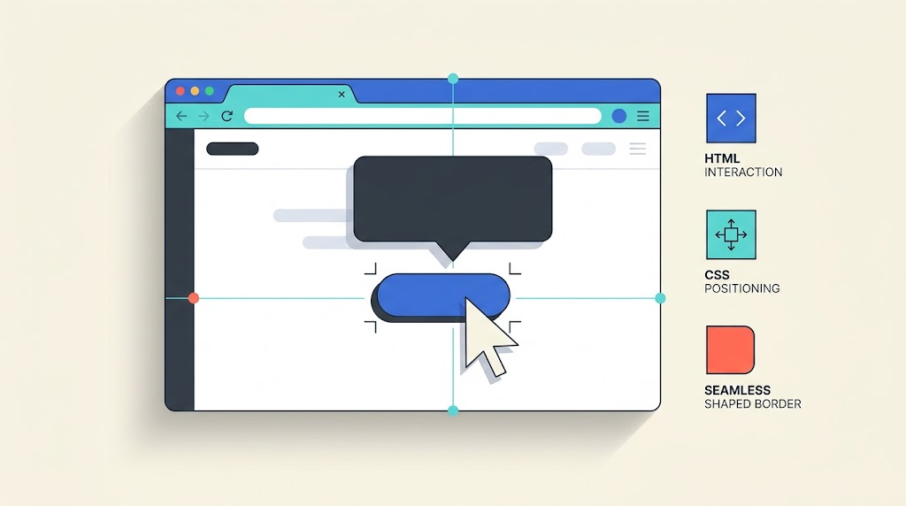
How native HTML interactions, CSS anchor positioning, and shaped borders can simplify a familiar UI component.
Adapted from an article by zhangxinxu, originally published on September 15, 2026, at 10:38, under JS Examples.
Original source: zhangxinxu.com
A small black tooltip sounds like a small task.
Then come the details: showing it on hover, delaying its appearance, positioning it above the trigger, drawing its arrow, and keeping everything aligned while the page scrolls.
For years, implementing that behavior meant combining JavaScript event handlers, positioning calculations, and CSS pseudo-elements.
Modern browser features offer a more direct approach. In supporting browsers, HTML and CSS can handle the tooltip’s interaction, placement, and outline without custom JavaScript for showing or hiding it.
The interesting part is how these features work together—and how knowing about them changes the instructions we give AI coding tools.
Let the Browser Handle the Interaction
The implementation combines three responsibilities:
| Responsibility | Native feature |
|---|---|
| Show and hide the tooltip | interestfor with popover="hint" |
| Position it relative to its trigger | CSS anchor positioning |
| Draw the bubble and its border | shape() with border-shape |
An interest invoker is an element that responds when a user shows interest, such as by hovering over it or focusing it. Its interestfor attribute identifies the target element.
When that target is a popover, the browser can manage its visibility. CSS controls the delay through interest-delay-start. The association also creates an implicit anchor reference, which lets CSS position the popover relative to its trigger. MDN: Using interest invokers
This makes the division of work straightforward: HTML describes the relationship, and CSS describes the presentation.
Why Use popover="hint"?
A tooltip should be able to appear while a larger popover—such as a menu—remains open.
The hint popover type supports that pattern: opening a hint does not automatically close an existing auto popover. It can, however, close other hint popovers, so it does not mean that every previously opened popover remains visible. MDN: The popover attribute
Positioning Without Coordinate Calculations
The declaration position-area: top places the tooltip above its associated anchor.
The anchor relationship matters. That declaration alone cannot position an arbitrary element next to an unrelated button. Here, the interest-invoker relationship supplies the anchor. MDN: Using interest invokers
For this simple placement, application code no longer needs to read the button’s bounding rectangle and calculate the tooltip’s coordinates.
Draw the Bubble as One Shape
A speech-bubble tooltip has two connected parts: the body and the pointer.
Traditional implementations often draw these separately. Matching a faint border around both parts can require overlapping pseudo-elements or approximations with shadows.
The source implementation defines a single outline using shape(). It then reuses that outline in two ways:
clip-pathclips the background into the bubble silhouette.border-shapeadds a border that follows the outline when supported.
With a single shape value, border-shape draws the border along the defined path. MDN: border-shape
The author’s practical lesson was that generating the geometry proved harder than assembling the component. In their experiments, AI produced unreliable shape() syntax. Their workaround was to generate a traditional SVG path first, then convert it using their CSS path()-to-shape() converter.
That is a useful workflow for unfamiliar syntax: produce an intermediate representation you can inspect, then convert and verify it.
Example 1: A Native Tooltip
The following example condenses the tooltip implementation from the original article. It retains the shared shape, the 200-millisecond delay, anchor positioning, and the enhanced border.
The HTML and CSS are shown together so the relationship between the trigger and its tooltip is easy to follow.
<button class="button-mention" interestfor="tooltip">
  Dark Mode Cover Image
</button>
<div id="tooltip" class="mention-tooltip" popover="hint">
  Click or press Tab to insert
</div>

<style>
  .button-mention {
    interest-delay-start: .2s;
  }

  .mention-tooltip {
    --tooltip-shape: shape(
      from 5% 0%, hline to 95%,
      arc to 100% 21.05% of 5% 21.05% small cw,
      vline to 57.89%,
      arc to 95% 78.95% of 5% 21.05% small cw,
      hline to 55%, line to 50% 100%,
      line to 45% 78.95%, hline to 5%,
      arc to 0% 57.89% of 5% 21.05% small cw,
      vline to 21.05%,
      arc to 5% 0% of 5% 21.05% small cw, close
    );

    position: fixed;
    inset: auto;
    position-area: top;
    width: max-content;
    margin: 0 0 2px;
    padding: 2px 8px 8px;
    border: 0;
    aspect-ratio: 4.211;
    background-color: #000;
    color: #fff;
    font-size: 12px;
    line-height: 2;
    clip-path: var(--tooltip-shape);
  }

  @supports (border-shape: none) {
    .mention-tooltip {
      clip-path: none;
      border: 1px solid #fff1;
      border-shape: var(--tooltip-shape);
    }
  }
</style>
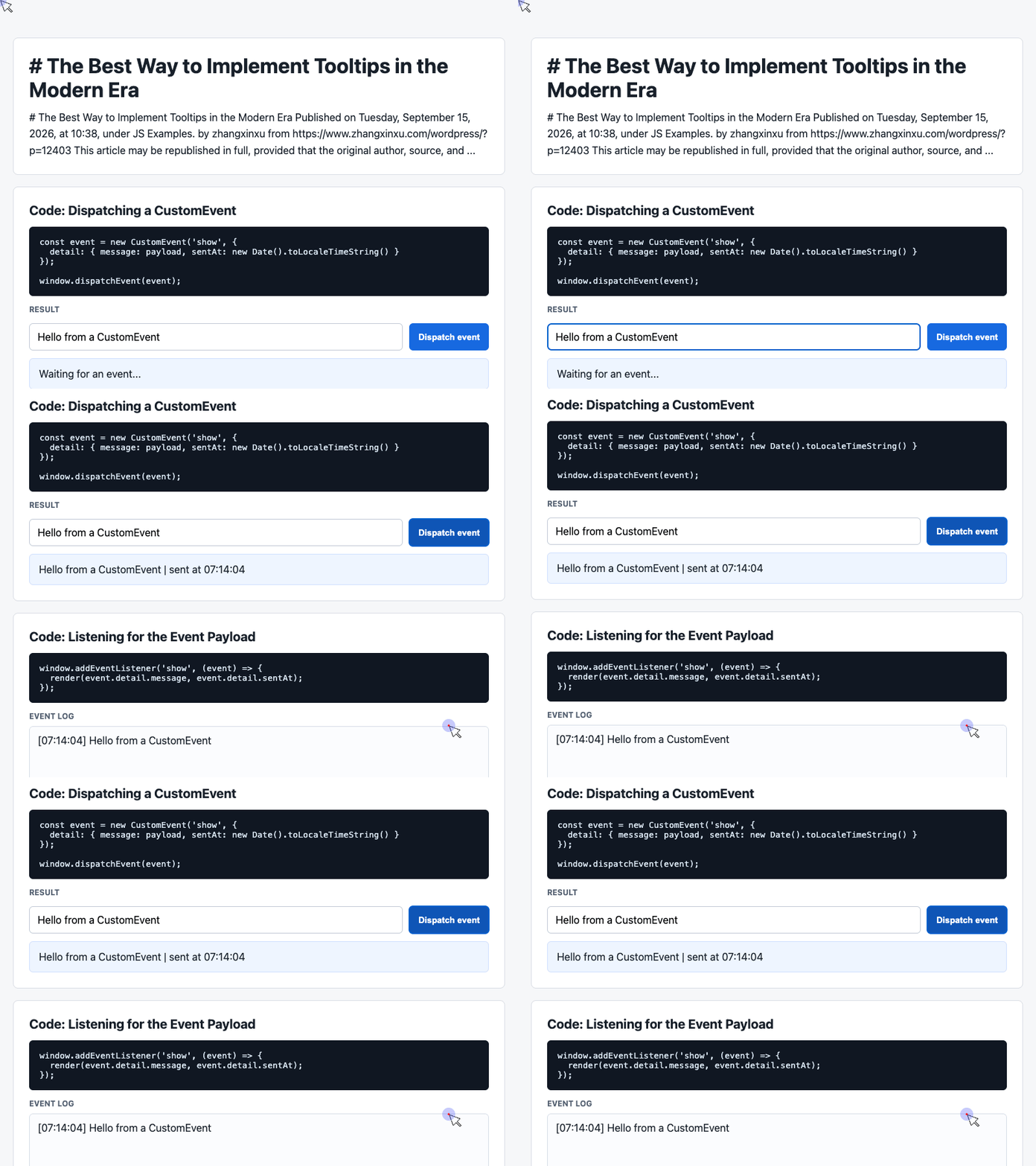
🎮 Try it live: Open the interactive demo to experience this yourself.
The custom property --tooltip-shape keeps the geometry in one place. The feature query switches how that geometry is rendered without duplicating its definition.
Two quieter declarations also contribute:
width: max-contentsizes the tooltip around its content.aspect-ratio: 4.211preserves the proportions used by this particular bubble design.
The snippet implements the tooltip presentation. The editor’s actual insertion action remains application behavior.
A Visual Fallback Is Only One Part of Compatibility
The clip-path branch provides a fallback for the shaped border. It does not replace unsupported interest-invoker behavior or anchor positioning, and it still depends on support for shape().
Treat those capabilities separately when choosing a fallback for your audience. Check the current compatibility information for interest invokers, anchor positioning, and border-shape.
Also test the interaction with keyboard focus, near viewport edges, and with longer text. A compact, fixed-text demonstration does not cover every production layout.
What the Supplied JavaScript Demo Actually Demonstrates
The accompanying generated demo implements a custom-event dashboard. It contains an input, a “Dispatch event” button, a latest-message card, and an event log.
It does not contain the native tooltip implementation above.
Its code is still useful for illustrating application-level communication: one part of the interface emits information, and another part renders it. The next two examples are extracted from that demo’s executable script.
Use them together with the demo’s existing HTML and styles.
Example 2: Dispatch a Message and Timestamp
The click handler reads the input, supplies a default message when necessary, and dispatches a CustomEvent. Its detail object carries the message and timestamp to the listener.
const input = document.querySelector('#payload');

document.querySelector('#dispatch').addEventListener('click', () => {
  const message = input.value.trim() || 'Default CustomEvent payload';

  const event = new CustomEvent('show', {
    detail: { message, sentAt: new Date().toLocaleTimeString() }
  });

  window.dispatchEvent(event);
});
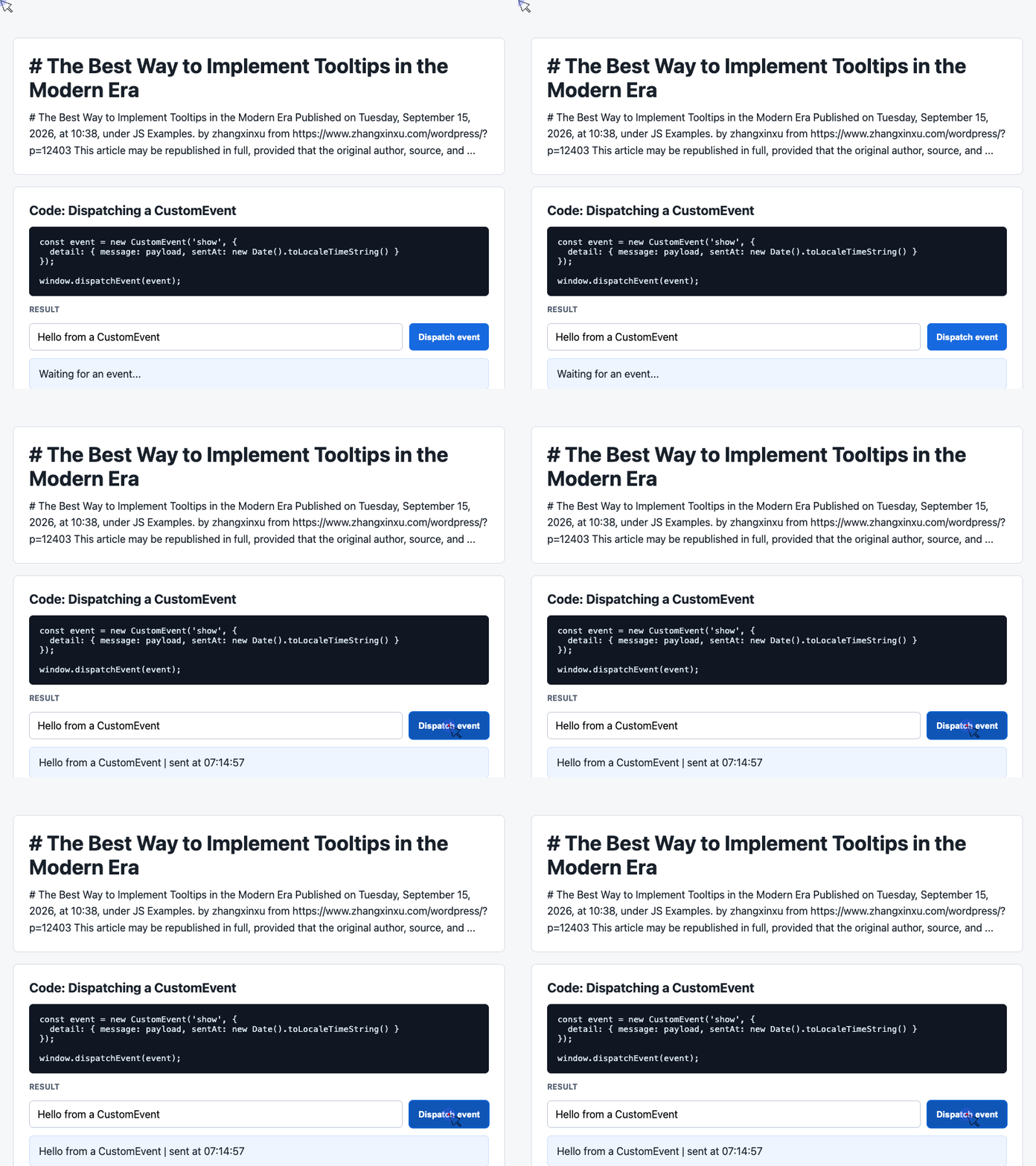
🎮 Try it live: Open the interactive demo to experience this yourself.
The handler emits data; the listener below produces the visible update.
Also notice that 'show' is simply the event name chosen by this demo. Dispatching it does not invoke the Popover API or automatically display a tooltip.
Example 3: Render the Latest Message and Event History
The receiving side updates the message card and prepends each event to the history. It displays the six most recent entries.
const latest = document.querySelector('#latest');
const log = document.querySelector('#event-log');
const history = [];

window.addEventListener('show', (event) => {
  const detail = event.detail || {};

  latest.textContent = detail.message + ' | sent at ' + detail.sentAt;
  history.unshift('[' + detail.sentAt + '] ' + detail.message);
  log.textContent = history.slice(0, 6).join('\n');
});
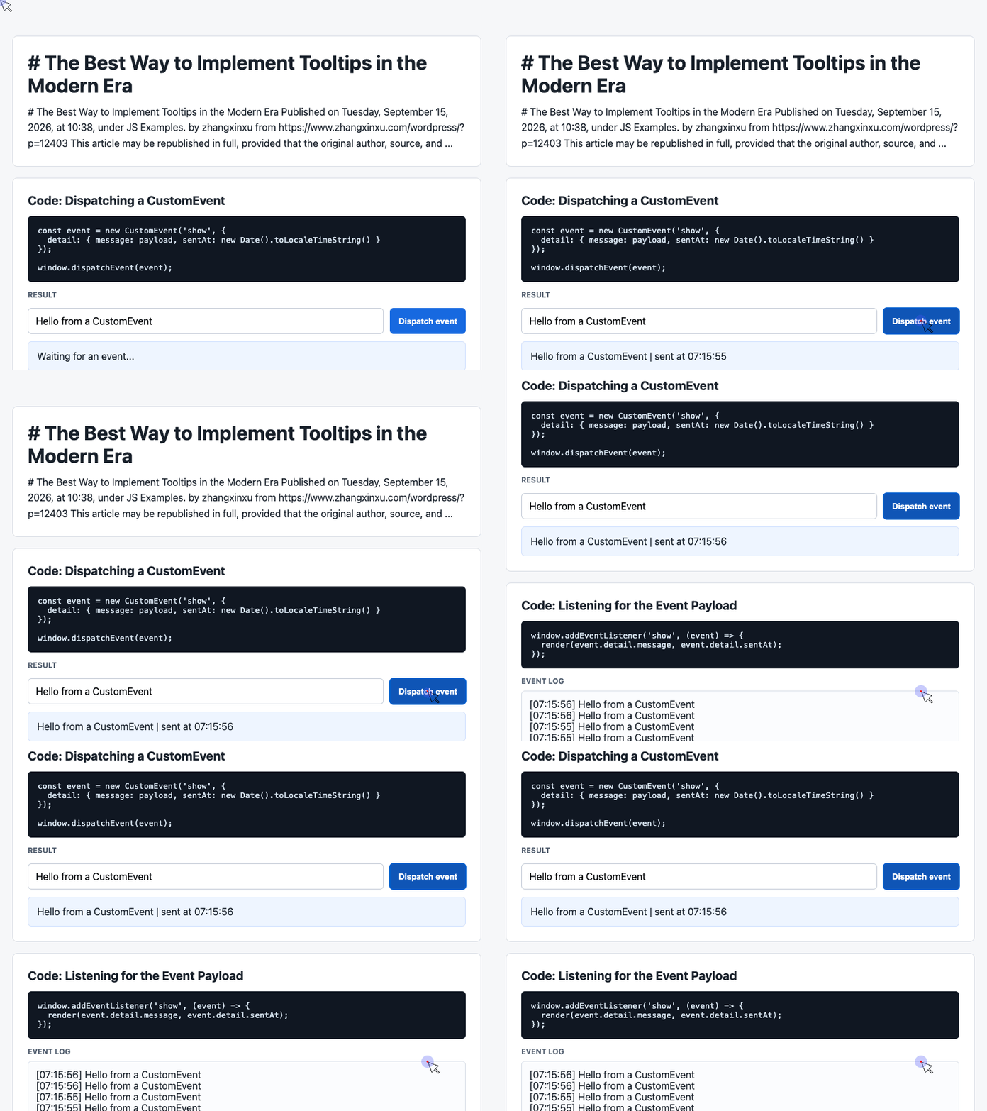
🎮 Try it live: Open the interactive demo to experience this yourself.
Using textContent renders the message as text. The demo’s existing white-space: pre-wrap styling makes the newline-separated history appear on separate lines.
There is also a small implementation detail worth noticing: slice(0, 6) limits the displayed entries, while the underlying history array continues to grow.
These examples show a reasonable role for JavaScript in a larger interface: transporting and rendering application data. The native tooltip example assigns its display behavior to browser features.
Getting AI to Choose the Right Implementation
The original article’s broader lesson concerns AI-assisted development.
A model may recognize “tooltip” and immediately generate familiar event handlers, positioning utilities, and arrow pseudo-elements. To steer it toward a newer implementation, the developer needs to name the relevant browser capabilities.
A useful implementation brief would specify:
Use
interestforandpopover="hint"for the tooltip interaction. Position it with CSS anchor positioning. Reuse one shape definition forclip-pathandborder-shape. Add a 200-millisecond appearance delay, and identify the required browser support before implementing fallbacks.
That gives the model concrete constraints.
Separate Setup from Interaction
A dynamically generated interface may still need JavaScript to create a shared tooltip element and insert it into the document once.
That setup does not require JavaScript to take over hover behavior. Keeping those responsibilities explicit helps prevent duplicate event handlers and unnecessary state.
Ask for a Change Plan
Before editing a larger project, have the model identify:
- Which files it intends to change.
- Which existing behavior it will reuse.
- Which browser features the implementation requires.
- Which fallback behavior it proposes.
The author’s iterations also exposed smaller sources of complexity: extracting constants used only once, adding redundant hide handlers, and mishandling the relationship between a custom tooltip and the native title attribute.
These details deserve review because they accumulate across a codebase.
Documentation helps, but the final check is still the implementation: does it use the APIs correctly, and does its visible behavior match the requirement?
The Best Tooltip Starts with Knowing the Platform
Modern tooltip development begins with understanding what the browser can already do.
For supporting browsers, interest invokers can manage visibility, anchor positioning can manage placement, and shaped borders can render the bubble as a single outline. Together, they can substantially reduce the custom machinery around a small UI component.
That knowledge also improves AI-assisted coding. Clear technical direction makes it easier to generate focused code, recognize unnecessary additions, and choose fallbacks deliberately.
The practical habit is simple: check the platform’s capabilities before designing the component.
Original author: zhangxinxu. Source: The Best Way to Implement Tooltips in the Modern Era. The original republication notice permits full republication with the author, source, and original links retained; requires AI crawlers to retain the original URL; permits excerpt aggregation; and requests that commercial users contact the author for permission.
Try It Yourself
Want to see these concepts in action? I’ve created an interactive demo where you can experiment with the code and see real-time results.
Explore more demos from my previous articles in the Demo Gallery.
Happy coding!